
简介
使用现代前端技术开发的应用,不管是 Web 页面,还是混合开发的手机 APP,都离不开页面元素的布局。而布局又可以说是页面开发里最麻烦的地方,不仅要兼容不同的设备,还要兼容不同的浏览器,还很可能一不小心改错了一个值就造成整个页面的雪崩。这里汇总下关于页面布局的基础知识以及一些开发中的经验。
环境
| 软件 | 版本 |
|---|---|
| 操作系统 | Windows 10 |
| Chrome浏览器 | 70 |
教程
这里假使读者已经有了基础的 CSS 知识。如果对这些基础知识还没有概念的话,如果继续往下看,可能会觉得比较难以理解和接受。
布局基础
CSS 布局重点在于 三大特性、盒子模型、浮动 和 定位 这几个方面,其他的背景啊、边框啊也都是细节,而这几个才是整个页面布局的基础。
显示模式
网页的标签非常多,并且不同的标签用于不同的场合,因此不同的标签也有不同的显示模式。比如两个 a 标签默认是可以放在一行显示的,而 p 标签则不可以,默认在页面上独占一行或多行。
块级元素
p 标签就是常见的块级元素,以及我们经常用来布局的 div 标签、h1 ~ h6 标签等,默认都是块级元素。块级元素由于可以对其设置宽高、对齐,因此常用于网页布局和结构搭建。
1 |
|
可以看到块级元素的几个特性:
- 独占一行或多行
- 宽高、内外边距都可以控制
- 宽度默认是占满整个容器
- 可以容器其他行内元素、块级元素
需要注意的是,p 标签和 h1 ~ h6 等文字类块级标签不可以容纳其他块级元素。
浏览器默认给一些块元素提供了外边距,所以页面上元素与元素之间还会有块空白。一般在实际开发中,都会重置所有元素的内外边距:
1 | * { |
这样页面上就不会有这么多无法掌控的情况了。
行内元素
行内元素不占有独立的区域,仅仅靠自身的字体大小和图像尺寸来支撑结构,一般不可以设置宽度、高度、对齐等属性,常用于控制页面中文本的样式。常见的行内元素有 a, b, del, i, span 等。
1 |
|
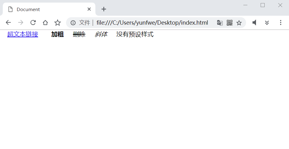
span 元素最为纯粹,可塑性非常高,所以经常会使用 span 标签来为文本添加各种样式。
行内元素的特点:
- 不会独占一行,会和相邻的行内元素在一行上显示。
- 无法设置高和宽,以及上下内外边距,但是左右内外边距可以设置。
- 它的内容有多宽,容器就被撑多宽
- 行内元素只能容纳文本或则其他行内元素。
a 标签比较特殊,也可以容纳块级元素。
行内块元素
行内块元素可以说就是允许设置宽高、内外边距(包括上下)、对齐属性的行内元素,比如常见的 img 标签,input 标签。下面看看行内块元素的显示:
1 |
|
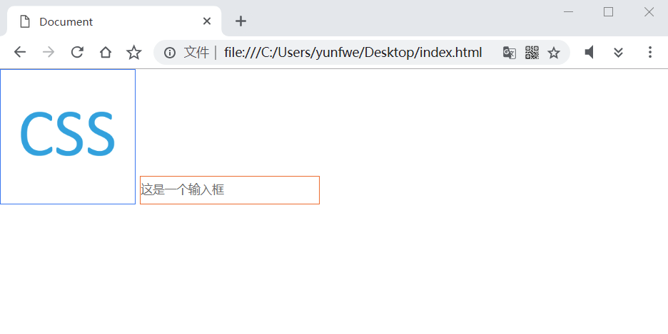
img 标签和 input 标签都可以设置宽高,img 标签默认与其他一行的元素以基线对齐(baseline),这里改为底部对齐(bottom)的方式让显示的更好看一些。还有个问题可以发现,即使已经设置了 margin: 0 和 padding: 0,可是两个行内块元素中间依然有个缝隙。下面总结行内块元素的特点:
- 和相邻行内或行内块元素在一行上,但是中间有空白缝隙。
- 默认宽度是它本身内容把它撑开的宽度。
- 宽高、内外边距都可以控制。
顺便一提 img 标签和文字在一行时的一些显示:
1 |
|
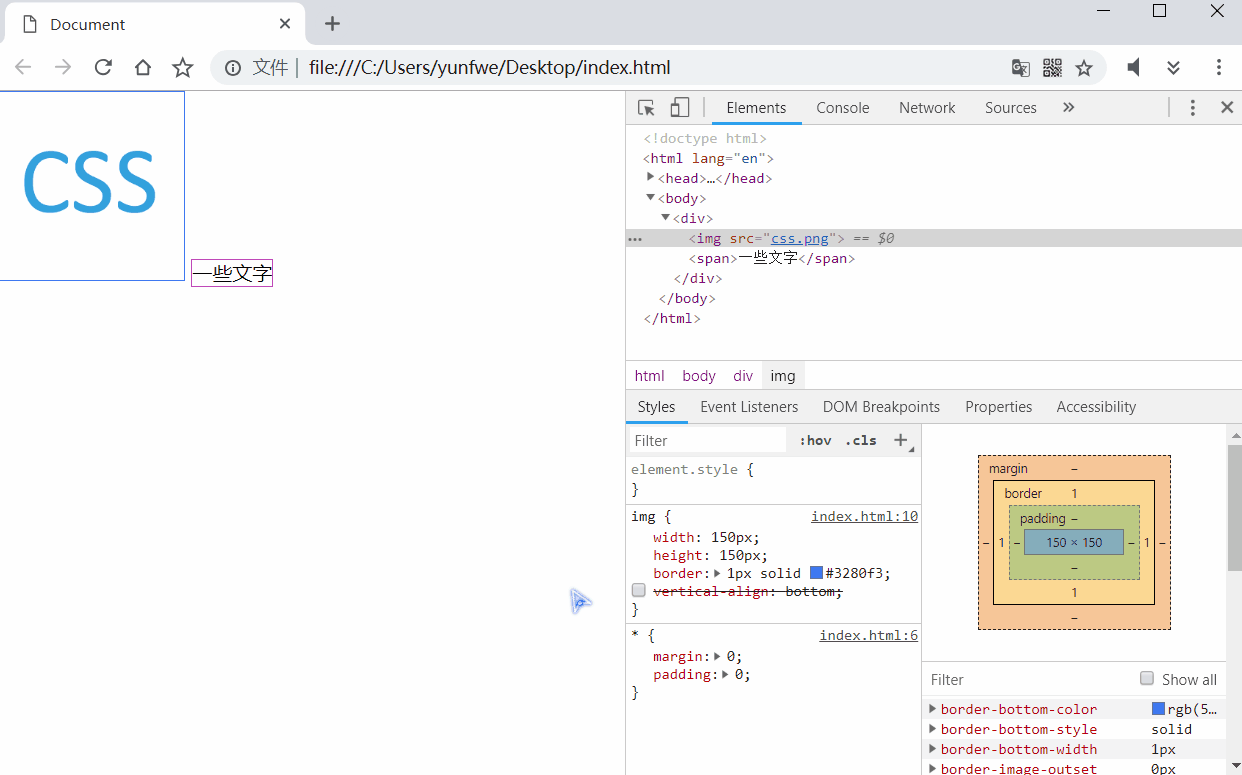
vertical-align 可以设置行内和行内块元素垂直对其的方式。img 和其他行内元素默认的对齐方式并不是底线对其的!所以可以看到 img 比 span 高出了几个像素。
同样这个问题也会出现,当使用一个 div 去包裹 img 的时候,img 并不是铺满整个 div 的。而是底边会留有几个像素:
1 |
|
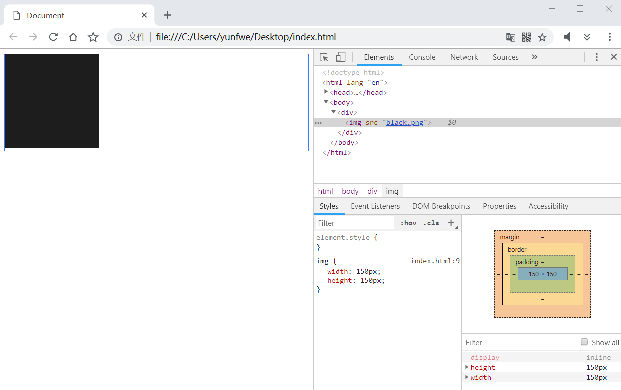
解决方法也很简单,将 img 的垂直对其方式设置为底边对其,或者 将 img 的显示模式转换为块元素
显示模式转换
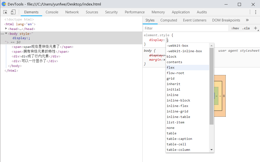
通过 display 属性可以转换元素的默认显示模式:1
2
3
4
5.box {
display: inline; /* 转换为行内元素 */
display: block; /* 转换为块级元素 */
display: inline-block; /* 转换为行内块元素 */
}
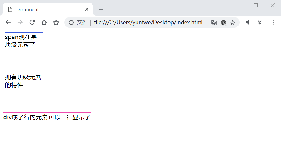
下面看一个例子:
1 |
|
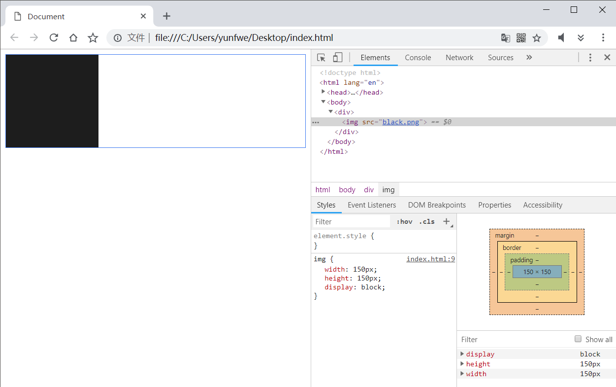
上面的 img 显示问题也可以通过显示转换来解决:
1 |
|
其他显示模式
这三种基本的显示模式几乎可以应付大部分的页面布局了,其中还有一些非常好用的显示模式,比如 display: flex 可以用来做另外一种页面布局,但是对老旧的电脑浏览器存在一些兼容性问题(比如 IE),如果是手机页面开发,display: flex 几乎可以想怎么用就怎么用了。
浏览器开发者模式中可以看到所有支持的显示模式:
三大特性
层叠性
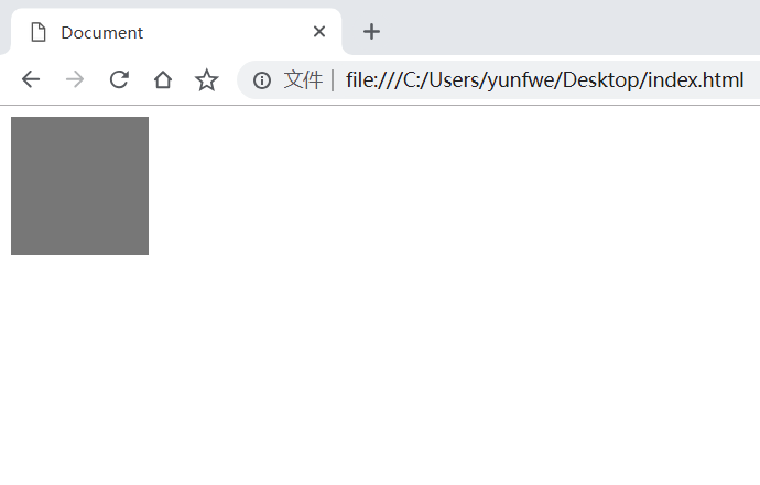
所谓层叠性,是指如果一个元素被应用了多个相同的 CSS 属性,那么浏览器如何处理这种冲突呢?先看一个例子。
1 |
|
在浏览器中查看效果,显示的是灰色的盒子:
接着把两个颜色替换下看看效果1
2
3
4
5
6
7
8
9
10#app {
width: 100px;
height: 100px;
background-color: gray;
}
#app {
width: 100px;
height: 100px;
background-color: red;
}
盒子变成红色:
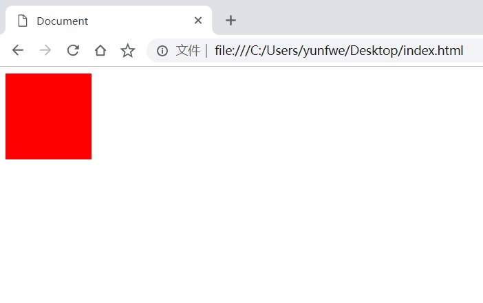
可以看到,是最后一次定义的 background-color 生效。也就是说,相同的 CSS 样式互相覆盖,只有最上面的一层 CSS 样式才最终被我们看到。
继承性
几乎所有(未来不知道有没有)的应用与文字上的样式,都具有继承性。也就是说,在父标签定义好的一些关于文字的样式,子元素都不需要重新定义。如果子元素需要不同的样式,只能通过在子元素上应用新的样式来层叠掉父元素继承来的样式。
子元素可以继承的样式有 text-, font-, line- 开头的所有元素以及 color 元素。下面看一个例子:
1 |
|
结果: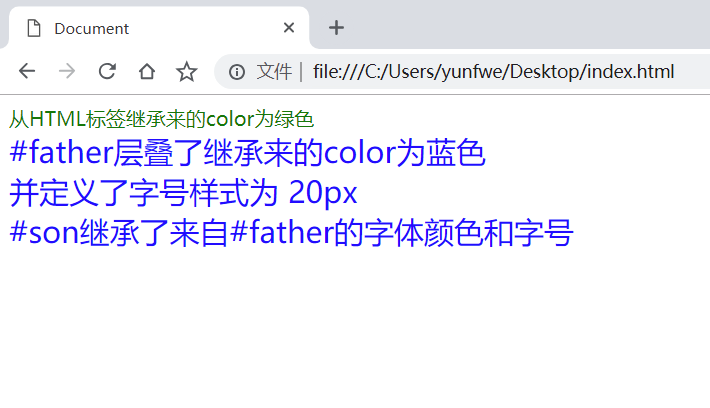
优先级
给元素定义样式的方式有好多种,比如ID选择器、类和伪类选择器、标签选择器等。如果通过不同的选择器给相同样式定义了不同的值,这时候样式的层叠就不太一样了。
CSS 给通过不同的选择器定义的样式提供不同的优先级,CSS 的层叠只发生在相同的优先级下,比如上面 CSS 层叠性的代码中,都是通过 ID 选择器来定义的样式。
CSS 使用一套权重系统来计算优先级,使用 0,0,0,0 这种值来计算权重,不同的选择器或者定义样式的方法(内联样式、继承来的样式、!important申明的样式)会给权重系统提供不同的贡献,最后根据总贡献值来确定哪一套样式会覆盖了哪一套,如果贡献值相同,那么就应用最后定义的那套。这个过程就叫做层叠。
下面这个表格表明了不同的选择器或定义样式的方式的贡献值:
| 方式 | 贡献值 |
|---|---|
| 继承来的样式 | 0,0,0,0 |
| 通配符选择器(*) | 0,0,0,0 |
| 标签选择器 | 0,0,0,1 |
| 类、伪类选择器 | 0,0,1,0 |
| ID选择器 | 0,1,0,0 |
| 内联样式 | 1,0,0,0 |
| !important申明 | 无穷大 |
可以将 0,0,0,0 的每一位当成一个级别,0,0,0,1 > 0,0,0,0,0,0,1,0 > 0,0,0,1,所以,!important > 内联样式 > ID选择器 > 类、伪类选择器 > 标签选择器 > 通配符选择器(*)和继承来的样式。
下面看一个例子:
1 |
|
结果: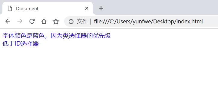
优先级是可以叠加的,比如:
1 |
|
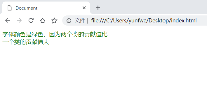
通过计算,.inner 的权重是 0,0,1,0,而 .box > .inner 的权重是 0,0,2,0,所以 .box > .inner 定义的样式会覆盖掉 .inner 定义的样式。同理,如果再加上 #app > .inner 还会覆盖掉 .box > .inner 定义的选择器,因为 #app > .inner 的优先级是 0,1,1,0。
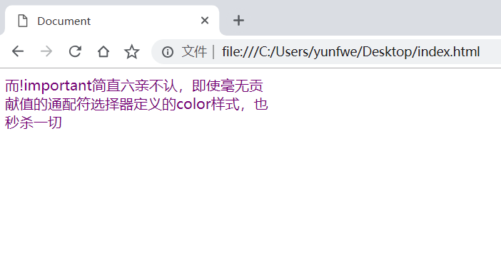
需要注意的是!CSS 的优先级没有进位,一百个类选择器定义的样式优先级也不会比一个ID选择器定义的样式优先级高!现在测试下 !important 的效果:
1 |
|
盒子模型
页面上每一个元素都像是一个盒子,盒子里面放的就是我们要展示的文字、图片或者其他的盒子。然后我们通过摆放盒子的位置来使内容合理的呈现在页面上。
内外边距和边框
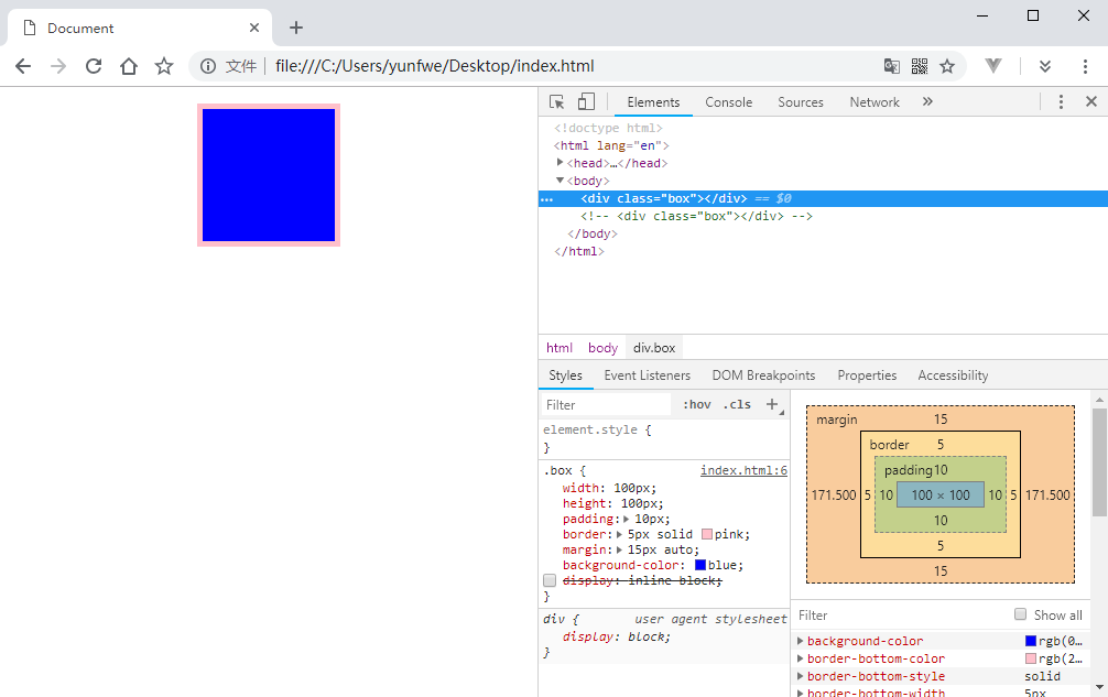
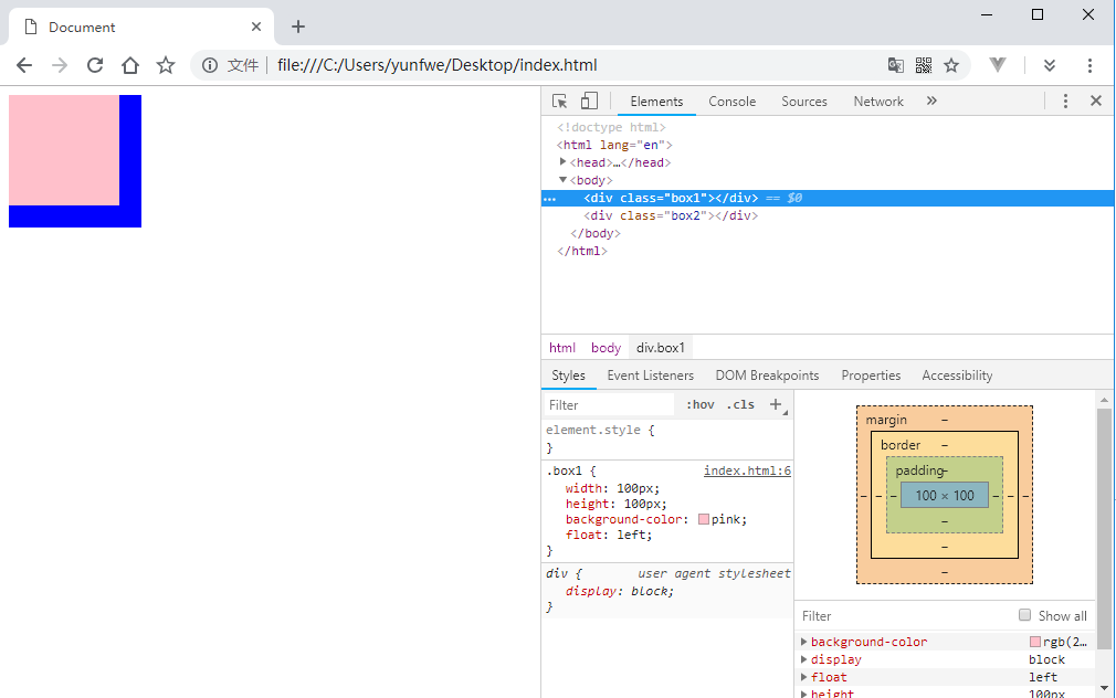
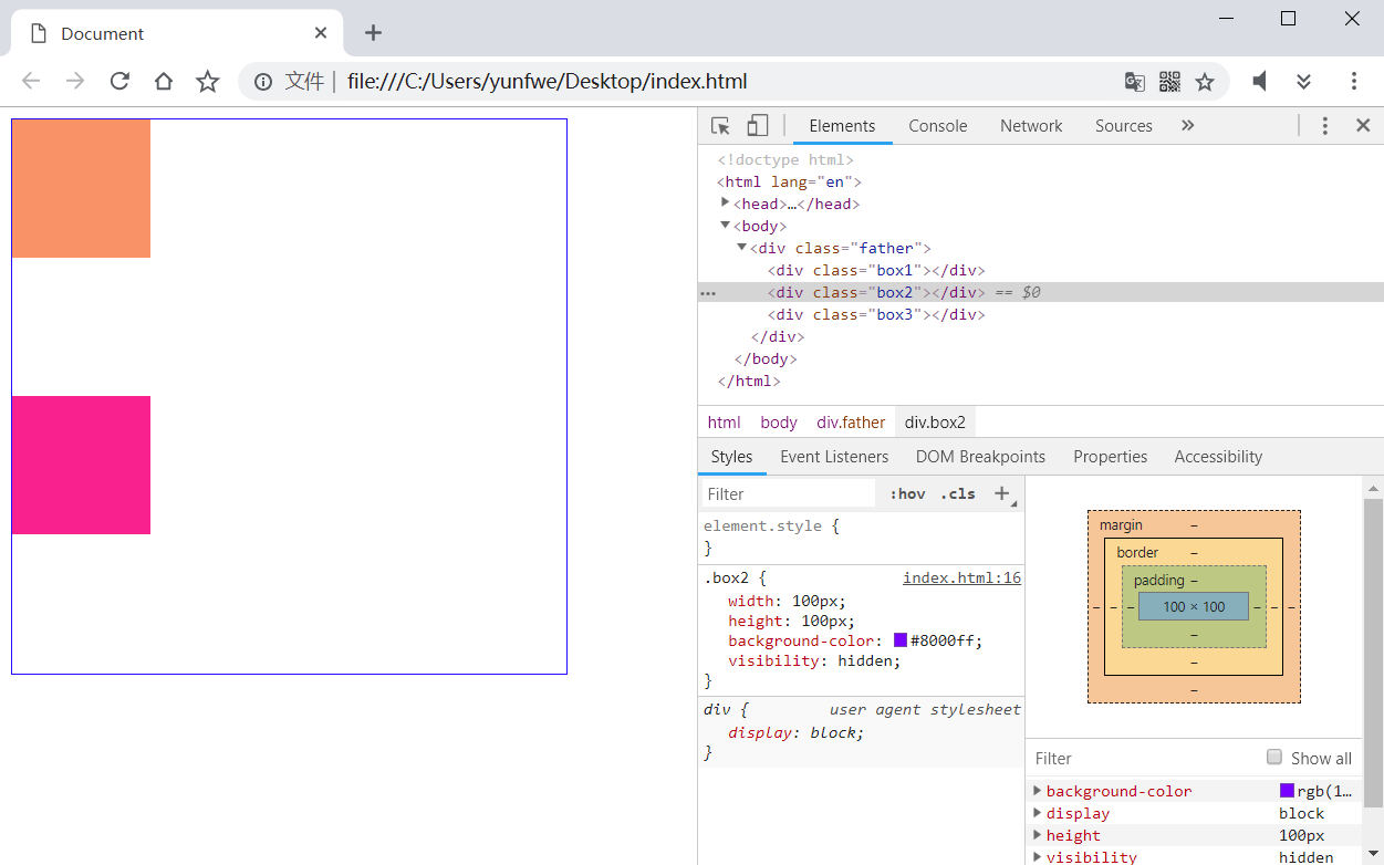
在现代浏览器中,每一个盒子都由 内容区域、内边距、边框、外边距 组成。
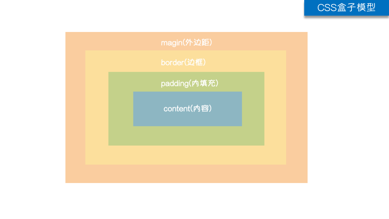
盒子模型可以比喻成我们拆快递,快递包装的厚度可以想象为边框,快递为了保护里面的东西会有一些填充物,这个填充物就可以当成内边距,而快递里面的东西就是实际的内容了。如果有多个快递,快递与快递之间的距离就是外边距了。下面看代码:
1 |
|
这里将两个 div 元素设置为行内块显示,然后开发者模式查看他们的盒模型:
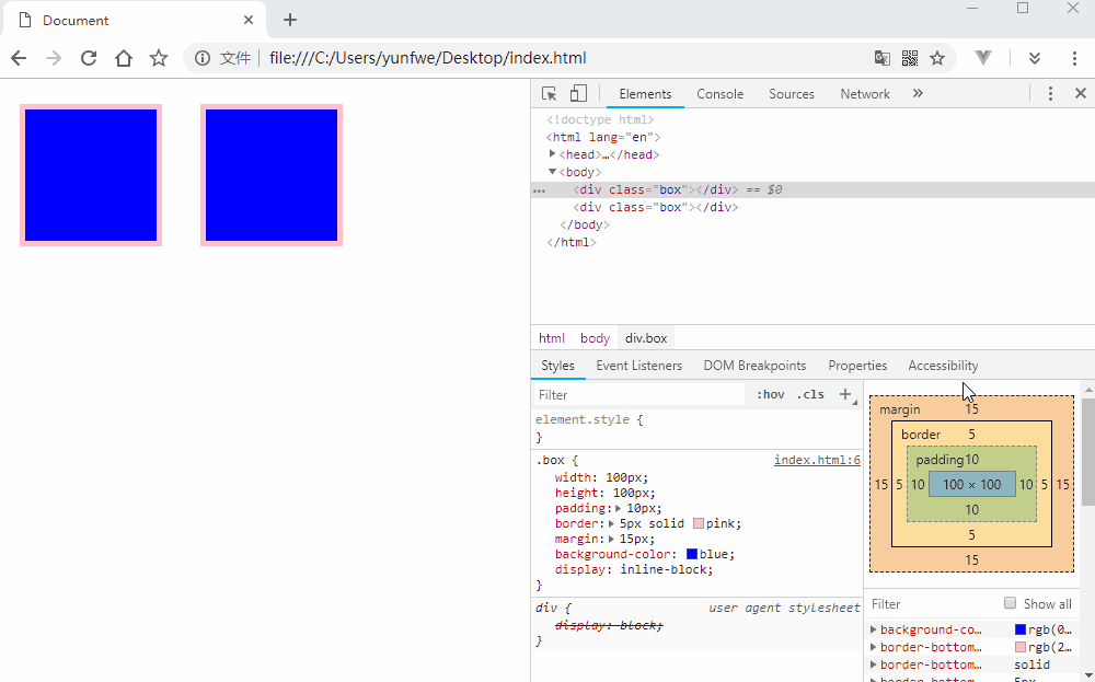
可以看到,给元素设置的宽高实际上是给盒子的内容区域设置的,而元素占的实际空间大小是要加上内外边距还有边框的。我们也可以单独为每一个边设置不同的内外边距还有边框,或者通过将盒子左右外边距设置为 auto 来让浏览器自动计算实现盒子居中显示:
1 |
|
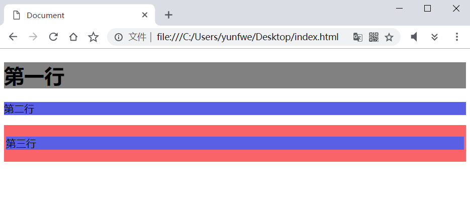
块元素的上下外边距合并
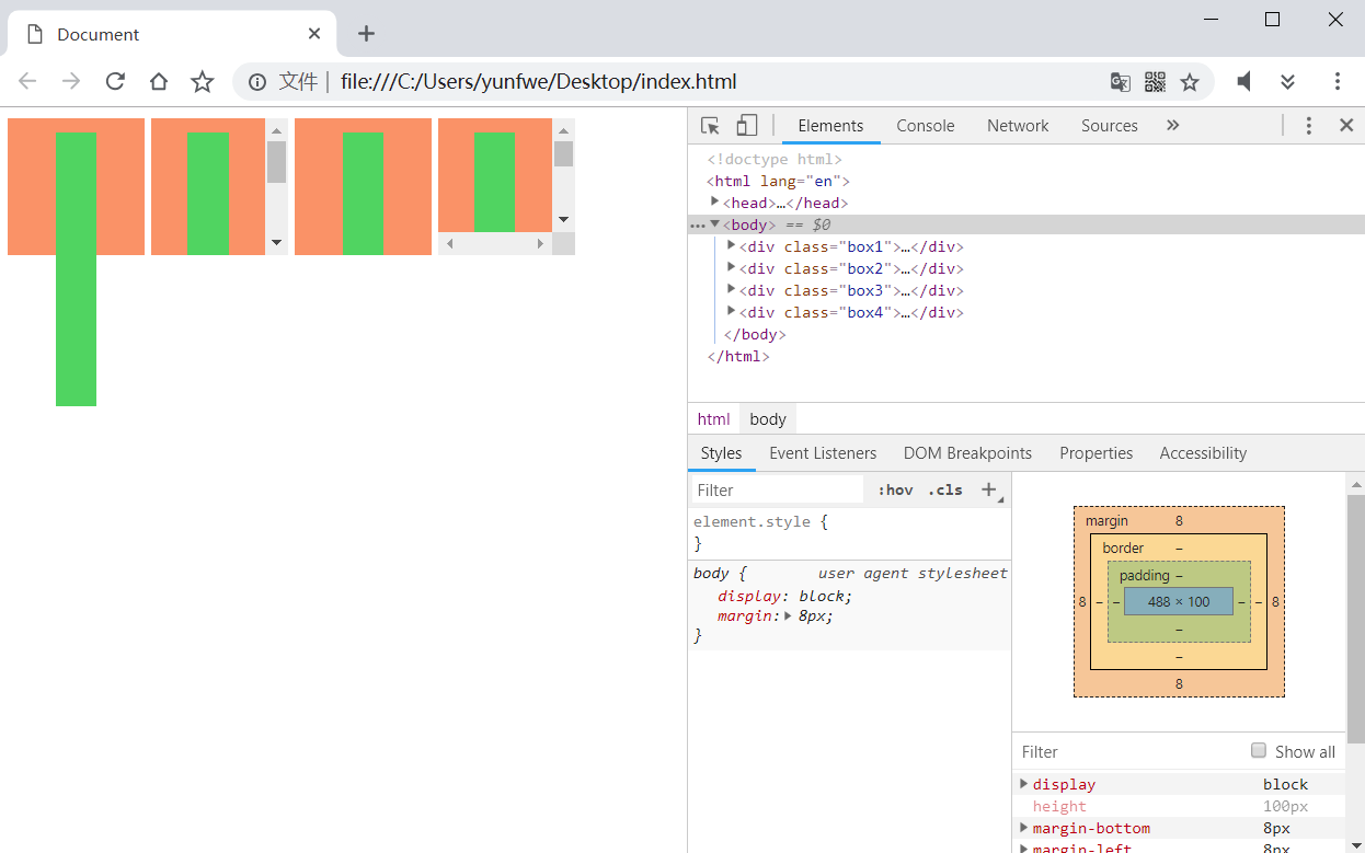
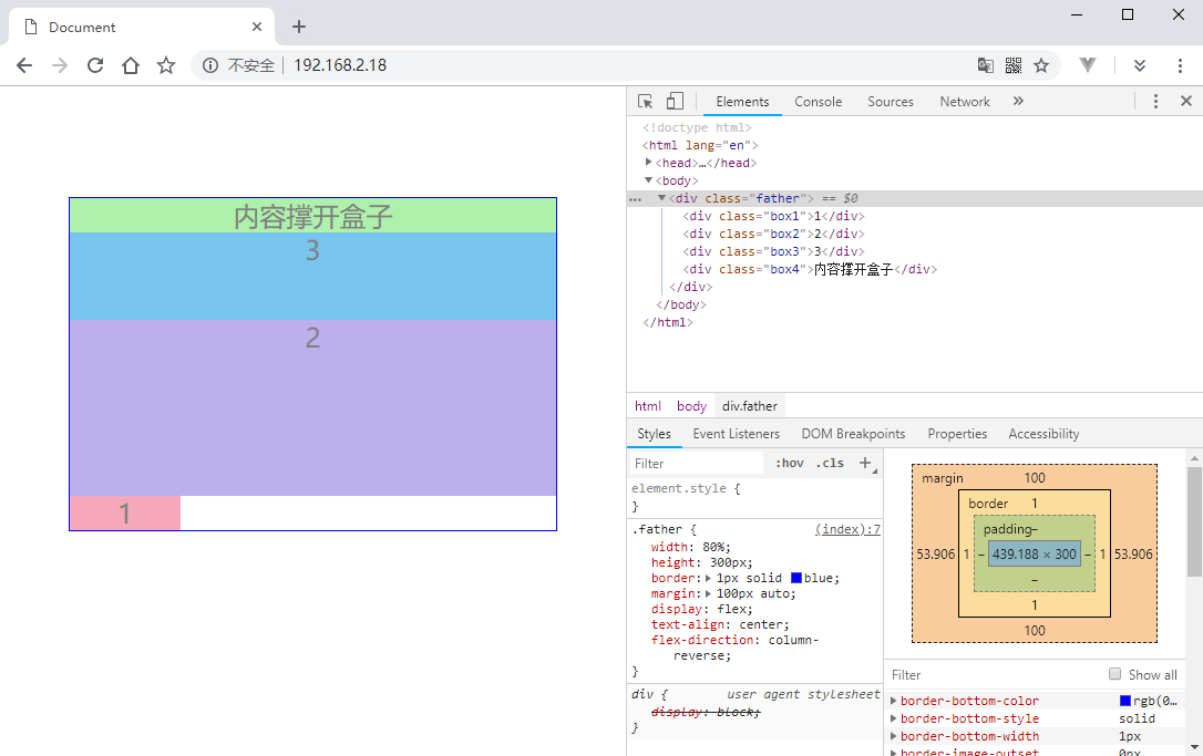
现在 .box 的显示模式是块元素了,如果相邻的两个块元素,上下外边距会有什么不同呢?
1 |
|
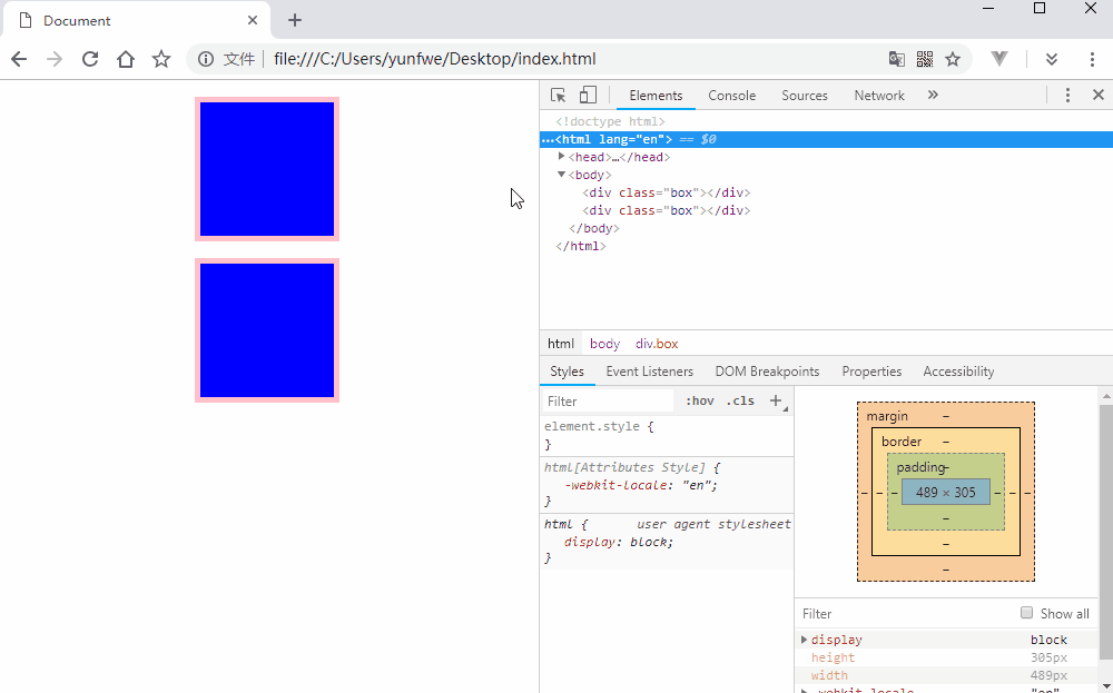
如果两个盒子的外边距不同,则会以外边距最大的元素为准:
1 |
|
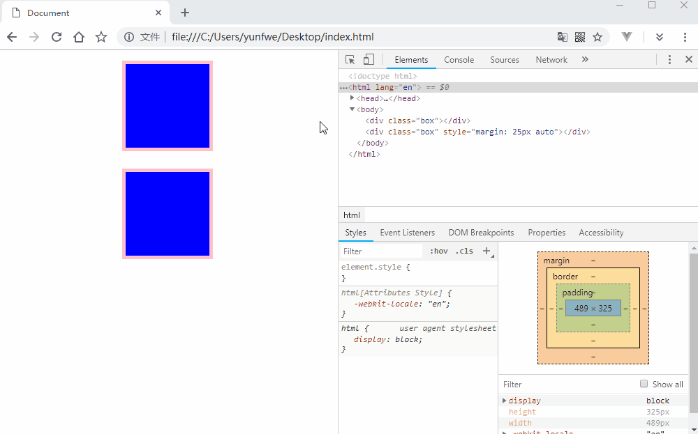
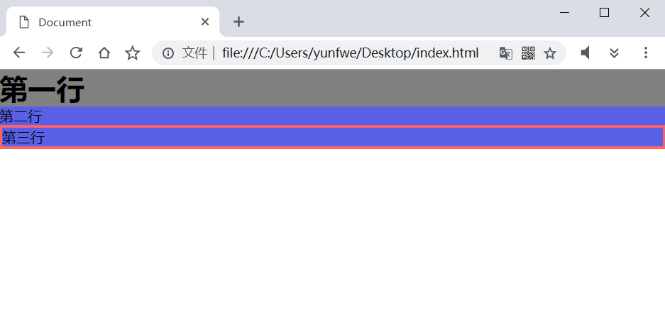
如何消除这个影响呢?也很简单,用一个父盒子将其中一个盒子嵌套起来,并给父盒子设置一个 overflow: hidden:
1 |
|
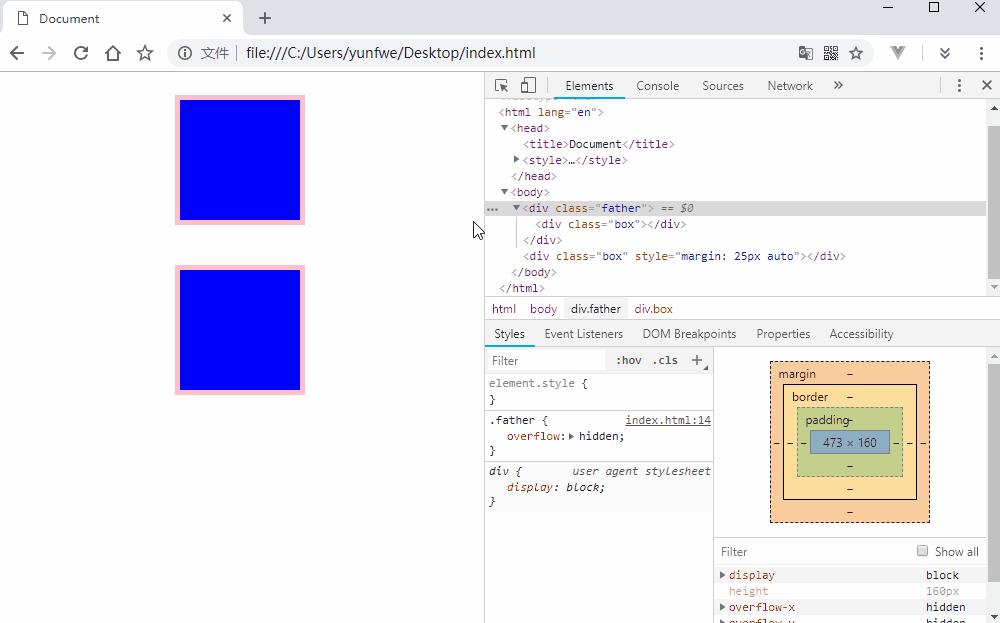
添加 overfiow: hidden 可以防止 margin 合并的原理是 .father 的盒子触发了浏览器的 BFC 机制,形成了自己的独立空间,但是它的元素占用空间是由里面的子元素撑起来的,父元素的外边距为 0,所以也不会与下一行的块元素发生重叠(如果给父元素设置了外边距,依然会跟下一行的重叠)。那么什么是 BFC 呢?
BFC(块级格式化上下文)
BFC 就是页面上的一个隔离的独立容器,容器里面的子元素不会影响到外面的元素。反之也如此。包括浮动,和外边距合并等等,因此,有了这个特性,我们布局的时候就不会出现意外情况了。
元素如何才能形成 BFC 呢?满足如下几个条件之一即可:
float的值不为noneposition的值不为static或relativedisplay的值为table-cell、table-caption、inline-block、flex或inline-flexoverflow的值不为visibility
利用 BFC 我们能做些什么呢?
- 上一节的例子已经看到,BFC 可以防止两个元素上下外边距合并的问题。
- 清除父元素内部的子元素浮动问题。
- 父元素内部右侧盒子自适应。
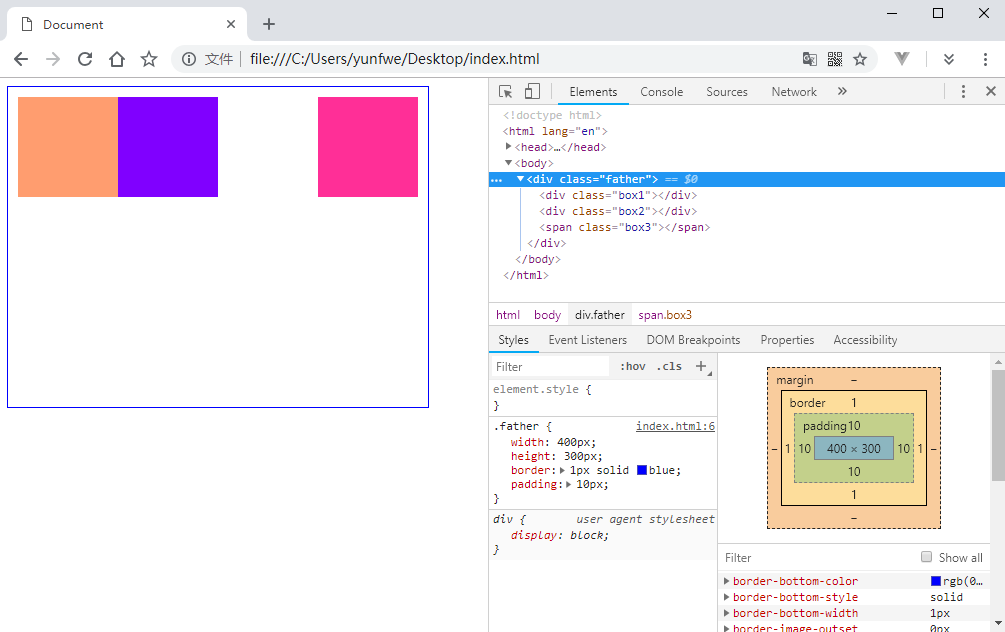
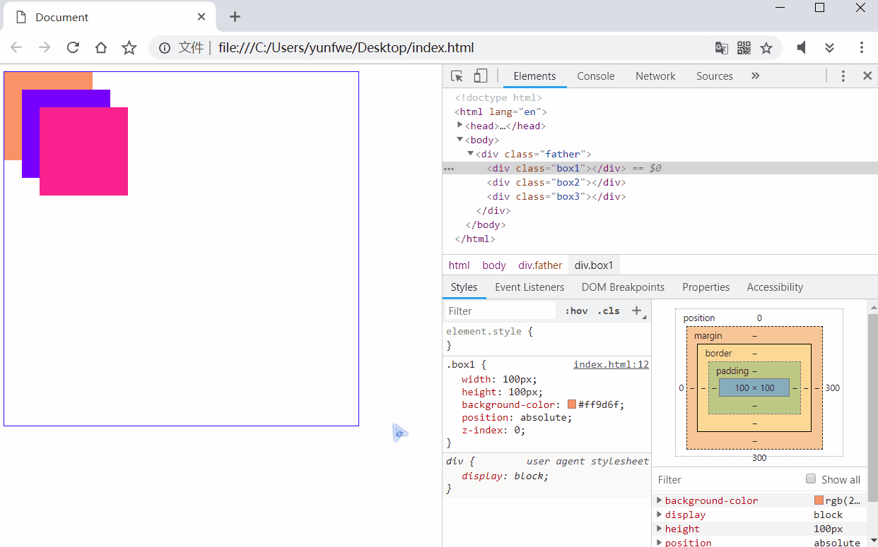
下面看一个例子:
1 |
|
当前元素都一行一行的正常排列着:
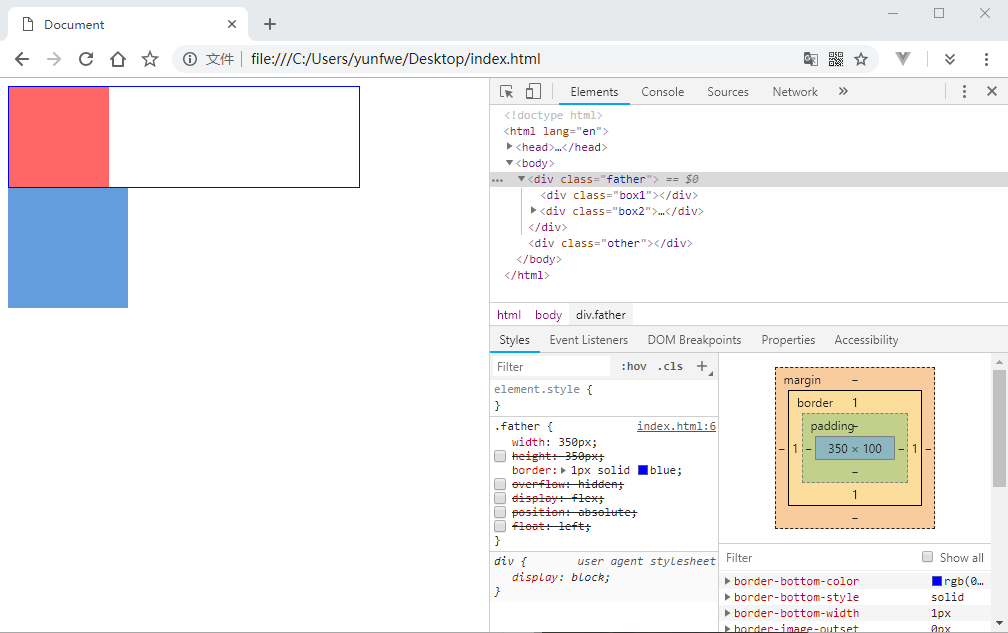
当我们给 .box1 添加浮动,一切都改变了:

.father 的内容高度变为了 0,变成了只剩靠 2px 的边框维持的一条线。.box1 与 .other 发生了重叠,这个就是因为父元素内部子元素浮动产生的问题,我们看看如何来解决这个问题:
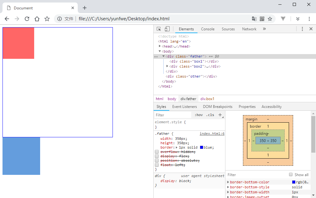
我们给 .father 设置了高度,这样看似解决了问题,但是这个高度不是因为内部子元素自动撑开的,而是我们手动设置的,如果内部子元素的高度发生变化,我们还得相应的修改父元素高度以适应,这样显然不是太合理。接下来看看如何使用 BFC 来解决这个问题:

首先尝试了使用 overflow: hidden 的方式,似乎完美解决了问题,但是如果内部盒子的宽度大于父盒子,则会被隐藏。接着使用 display: flex 的方式,这使用了 flex 布局。当使用了 position: absolute 和 float: left 的时候,虽然父元素形成了 BFC,并由内部子元素自动撑开了高度,但是却脱离了文档流,依然与下面的元素发生重叠。
在看看最后一个可以利用 BFC 解决的问题:“父元素内部右侧盒子自适应”。首先给父元素提供一个高度,然后将 .box2 的 display: none 状态取消:
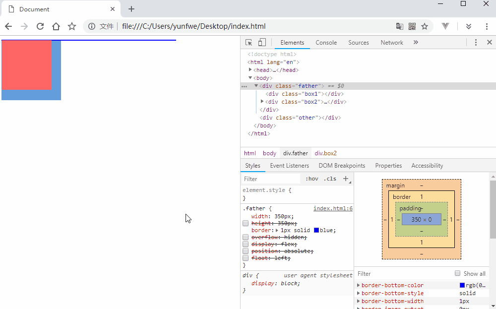
可以看到由于 .box1 的浮动,与 .box2 产生了重叠,并让 .box2 的文字与它产生了环绕效果。当我们让 .box2 形成 BFC 会产生什么效果呢?
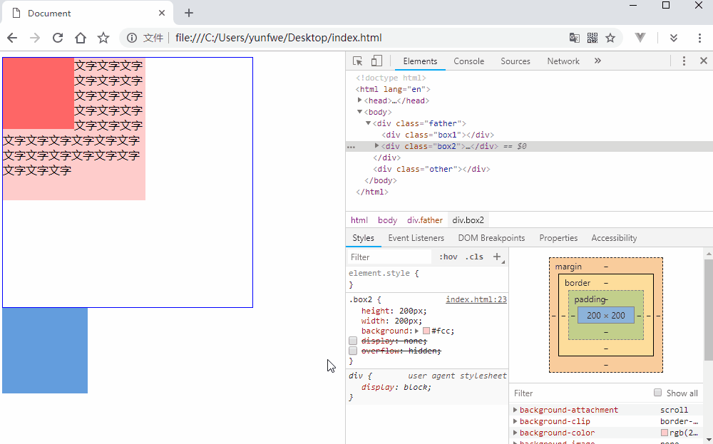
当使用 overflow: hidden 触发 BFC 后,.box2 的左边框紧贴着 .box1 的右边框。当取消手动指定的 .box2 宽度后,.box2 自动适应了 .father 剩余的宽度。
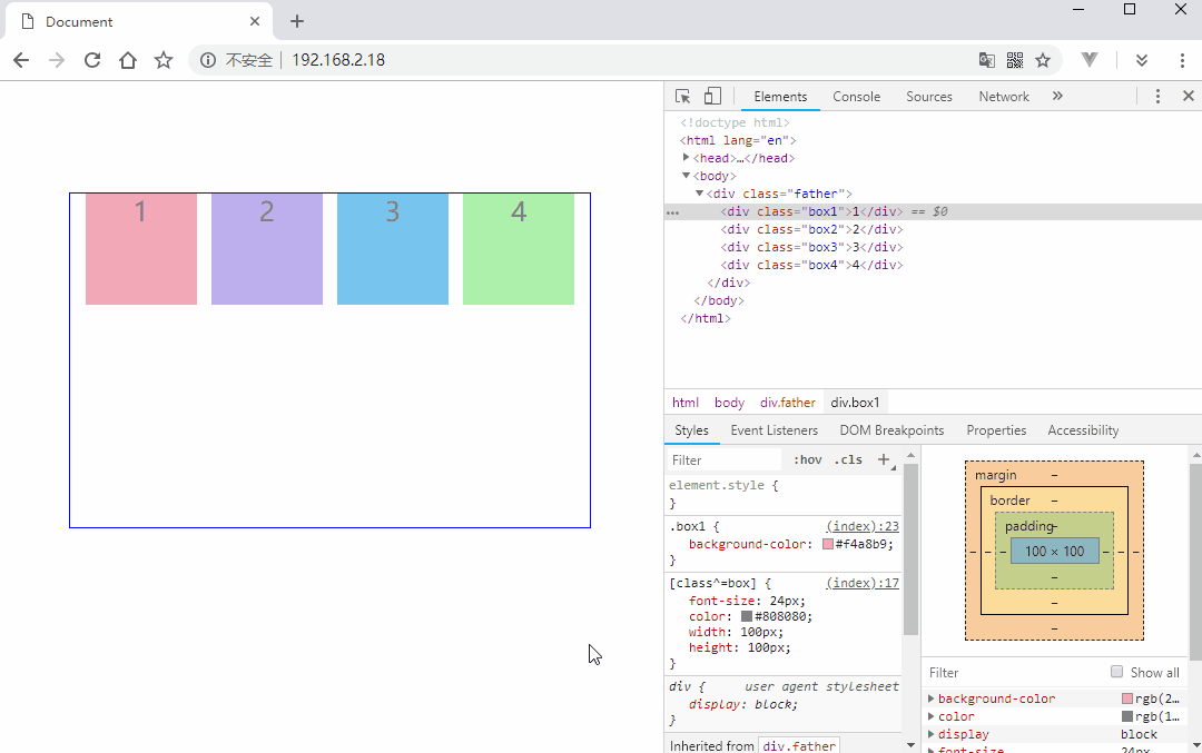
更改盒模型
默认我们对块元素设置宽高是内容区域的宽高,如果对这个盒子进行增加内边距和边框,都会使这个元素变大,这个默认模型是 content-box。还有一个常用的模型,让内边距和边框都包含到元素的宽高中,这种模型就是 border-box。
我们可以通过 box-sizing 来更改盒子模型:
1 |
|
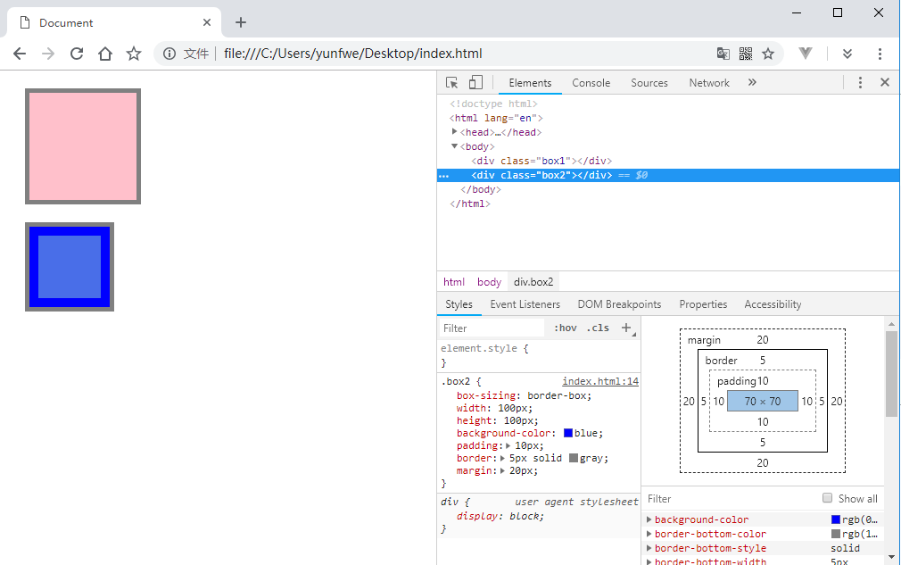
.box2 由于使用了 border-box 模型,所以去掉边框和内边距占用的区域,内容区域只剩下 70 × 70 了,看起来也比 .box1 小了很多。
定位机制
文档流
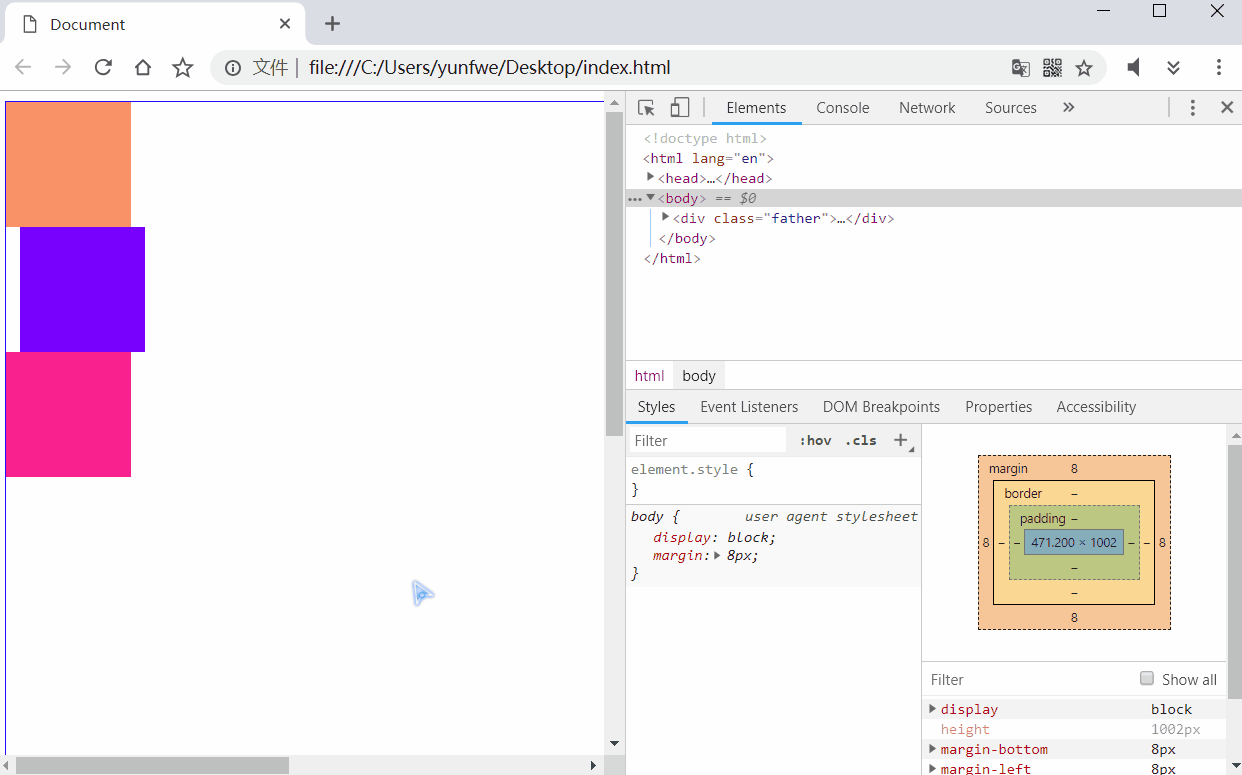
不给元素添加浮动或者定位的话,元素就放在文档流(或标准流)中。文档流实际上就是网页内的元素从左往右,从上往下依次排列的布局方式。如果给某个元素添加了浮动或者定位,那么它的显示就不会按照文档流的规则,我们称之为:脱离文档流。
当某个元素脱离的文档流,就不会占用文档流的位置了,所以经常会发现多个元素发生了重叠的现象。脱离了文档流的元素的层级会比文档流中的元素层级高,因此大多情况下都是脱离文档流的元素遮住文档流的元素。
1 |
|
浮动
浮动最早是用来控制图片,为了让其他元素特别是文字实现环绕图片的效果。后来发现浮动可以让任何盒子排在一行,而且中间没有间隙(inline-block 的两个盒子中间有间隙),慢慢的人们就会浮动的特性来布局了。
元素设置了浮动样式,会脱离文档流的控制,并移动到浮动样式设置的地方。浮动元素依然受限于父级元素,子元素浮动,父元素依然在文档流中。如果多个子元素都添加了浮动,那么这些元素都有了 inline-block 元素的特性
1 |
|
可以看到,所有添加了浮动的标签,都有了行内块元素的特性,但是会两边贴合没有缝隙。元素会按照浮动样式的值进行漂移,如果是 left 则会贴着父元素的左边排列,right 会贴着父元素的右边排列。但是子元素不会超出父元素的内边距距离。
浮动的特性:脱离文档流、不占用原本在文档流中的位置、会影响原本文档流的布局、只有左右浮动或者不浮动。
定位
我们如果想移动某个元素的位置,或者将某个元素直接放置到页面中一个固定的位置,如果不使用定位就非常麻烦或者不可能完成了。就连页面中各种各样的动画,也几乎都是通过定位来做的。
元素的定位属性主要包括定位模式和边偏移两部分,定位属性常用的有四种:static,relative,absolute,fixed。边偏移样式:top,bottom,left,right。一般偏移样式 top 和 bottom 只使用一个就够了,left 和 right 同理,不要既给元素设置了 left 然后又设置了 right。
偏移量不仅可以使用 px 等单位,还可以使用百分比:
1 | .box { |
并且元素如果添加了定位(除了static定位)都会像给元素添加了浮动一样,将元素模式转换为行内块模式。因此即使是行内元素,也可以直接设置高度和内外上下边距。
static
文档流中的所有元素都默认是这个定位方式,而且没法通过边偏移样式进行改变元素位置。
relative
相对定位:相对与自身原本在文档流中的位置进行边偏移。不脱离文档流,元素原本的占位依然保留。
1 |
|
给 .box2 添加了相对定位,并与原来位置的顶部保持 0px 的像素偏移和相对与原来位置的左边保持 0px 的像素偏移,然后浏览器开发者模式中手动调整这两个值试试看:
相对于 top 设置偏移时,如果值小于 0 则向上偏移,如果值大于 0 则向下偏移。left 如果值小于 0 则向左偏移,如果值大于 0 则向右偏移。
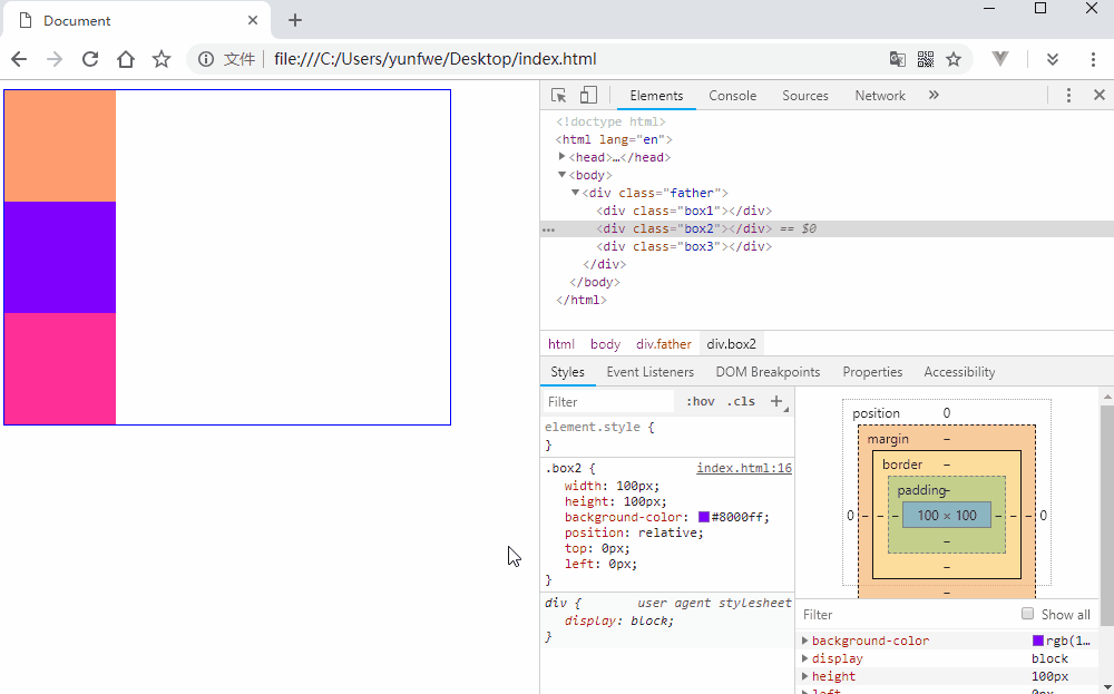
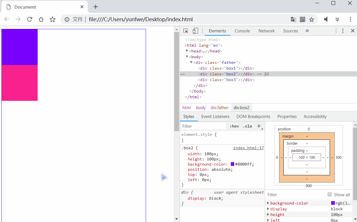
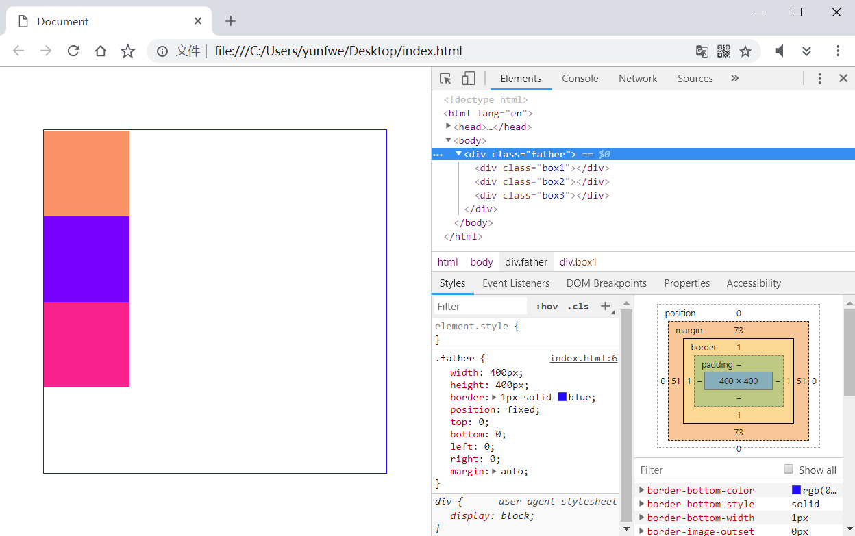
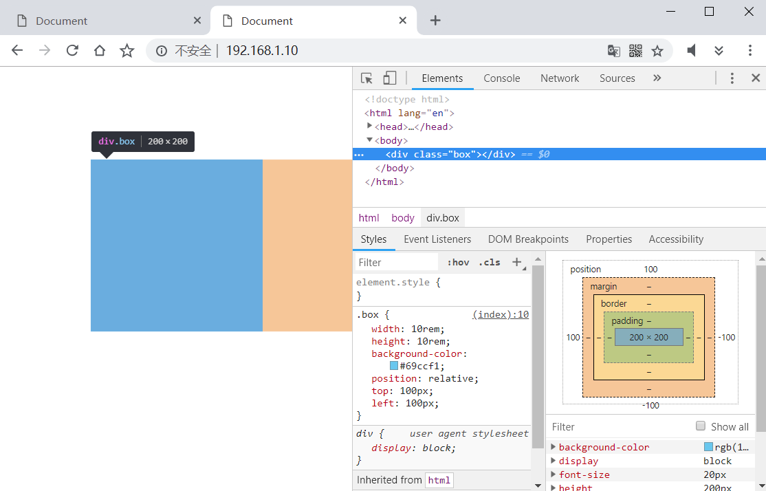
absolute
绝对定位:将元素根据最近的已经定位(相对、绝对、固定都可以)的父级或祖先级元素进行定位,如果所有的父元素都没有定位,则以 document 文档为基准进行定位。完全脱离文档流,元素原本的占位不保留。
因此如果想让某个元素以它的某个父或祖先元素进行定位,就需要给这个元素设置绝对定位,并给父或祖先元素也设置合适的定位方式,如果不想改变父或祖先元素的位置,也不想让父或祖先元素脱离文档流,那最好的方式就是给父或祖先元素设置相对定位。
1 |
|
这里将 .father 的长度设置为 1000px 使页面产生滚动条,然后将 .box2 改为绝对定位:

由于 .box2 的祖先都没有设置定位,因此它的绝对定位是以 document 整个页面为基准。完全脱离了文档流,所以它原来的位置被 .box3 所占据,并且当文档滚动时它也跟着滚动。如果想让它以 .father 元素为基准进行定位,又不想改变 .father 元素的位置,那么就最好给 .father 元素设置相对定位:
1 |
|
.box2 以 .father 为基准定位,所以覆盖了 .box1。如果想要元素相对于父元素水平和垂直居中对齐,可以将四个修改偏移的样式都设置为 0 ,然后将 margin 设置为 auto,看下面示例:
1 |
|
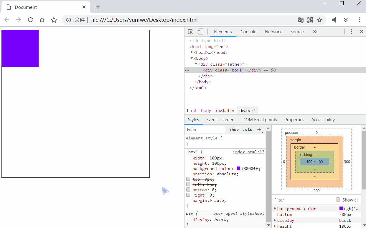
通过不同的偏移组合,可以将 .box1 定位到父元素中的 8 个位置上。
fixed
固定定位:永远以浏览器窗口为基准,不随页面滚动而滚动。完全脱离文档流,元素原本的占位不保留。
1 |
|
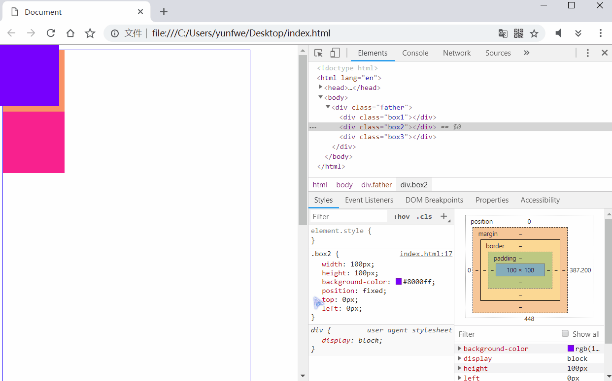
将 .box2 设置为固定定位,可以看到它并不随着页面的滚动而滚动。我们经常看到的页面双侧广告,是不是就是这样子的?固定定位也可以像绝对定位那样,通过将四个偏移样式都设置为 0,然后将 margin 设置为 auto 的方式实现元素相对于浏览器窗口永远水平和垂直居中:
1 |
|
sticky
CSS3 新增的样式,粘性定位,这个就比较有意思了。它相当于 relative 和 fixed 混合。最初会被当作是 relative,相对于原来的位置进行偏移。一旦超过一定阈值之后,会被当成 fixed,相对于视口进行定位。
1 |
|
有点意思吧!不是实际好像用的并不多。
层级
如果对元素使用了定位,就非常容易发生元素重叠的情况,我们可以使用 z-index 来调整定位元素的堆叠顺序,其取值可以为负整数、0 和正整数,值越大,则定位的元素越居上,如果值相同,则后定义的元素居上。
z-index 的默认值是 0,并且只有相对定位、绝对定位和固定定位才有此属性。其余标准流,浮动,静态定位都无此属性,也不可指定此属性。
1 |
|
显示与隐藏
CSS 中可以控制元素显示与隐藏的样式最常用的有三个,一个是 display,一个是 visibility,另一个是 overflow。
display
如果将元素的 display 设置为 none 将会使这个元素彻底的隐藏掉,元素原来的位置也不再保留:
1 |
|
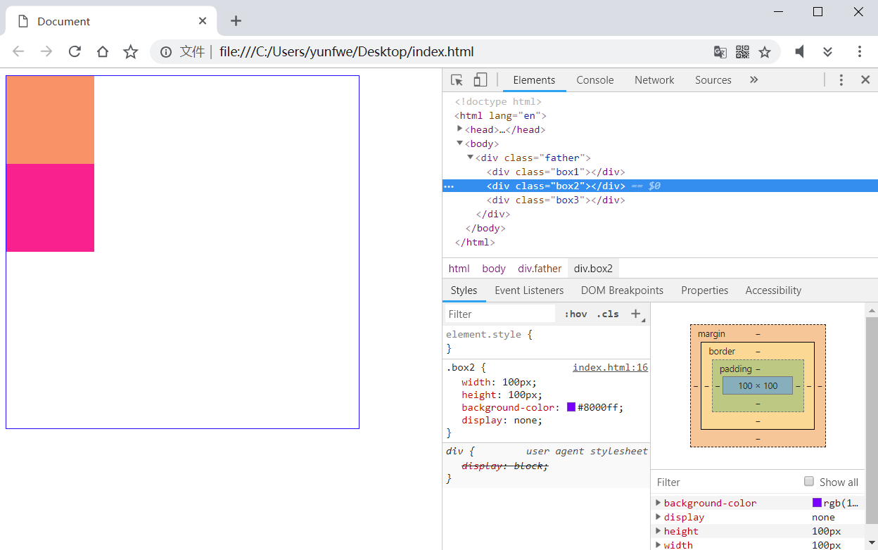
可以看到 .box3 显示在原来 .box2 的位置。于此对应的是,将一个隐藏元素的 display 设置为原来的显示模式(一般是 block),元素就可以再出现了。
visibility
visibility 与 display 不同的是,隐藏元素后,会保留原来的位置。visibility 的值为 hidden 时元素隐藏不可见,值为 visible 时元素显示出来。
1 |
|
overflow
overflow 和上面两个的作用就不太一样了,它主要用于设置当对象的内容超过其指定高度及宽度时如何管理内容。
overflow: visible:默认值,不剪切内容,也不添加滚动条。overflow: auto:超出自动添加滚动条,否则不加overflow: hidden:超出部分隐藏掉overflow: scroll:不管是否超出,都显示滚动条
1 |
|
屏幕与像素
常用单位
页面开发中,我们用的最多的就是使用 px 作为单位来编写样式了,偶尔也会用到百分比来写一些元素自适应父元素的样式。但是在移动开发中,为了让一套页面可以适应多套屏幕尺寸,px 就不太适用了。
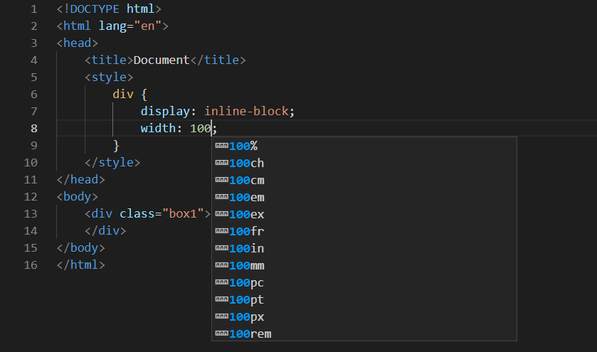
图中可以看到,当我们给元素设置宽高时,IDE 给我们显示出了所有可用的单位。
| 单位 | 描述 |
|---|---|
| % | 相对于父元素相同属性的百分比。 |
| px | 像素点,跟屏幕的物理性质相关。 |
| in | 英寸,跟 px 的换算是 1in == 96px (基于屏幕为 96 DPI计算) |
| cm | 厘米,并非生活中的厘米,这里 1cm == 37.8px |
| mm | 毫米,1mm == .1cm == 3.78px |
| em | 基于当前容器的字体大小,font-size 是多少,1em就是多少 |
| rem | 与 em 类似,不过 rem 是基于根元素(html)的字体大小 |
| pt | 印刷行业常用单位,1pt == 1/72英寸 |
屏幕 DPI(PPI)
现在电脑屏幕的主流分辨率都是 1920 × 1080 了,而手机屏幕也大多都是这个分辨率,那么电脑上看到的 100px 和手机看到的 100px 能一样长吗?答案当然是不一样。
我们常用英寸来表示屏幕尺寸(屏幕对角线长度),比如现在手机屏幕尺寸大多都是 5.5 英寸,笔记本电脑的屏幕有 13英寸、15英等,显示器的尺寸就更大了,21英寸、23英寸、甚至现在的电视剧都 55英寸以上。屏幕分辨率则以像素作度量的,屏幕分辨率这些年也越来越高,当年的 720p 的屏幕,现在 1080p 的分辨率是主流,甚至高端产品有 2k 屏甚至 4k 屏。
屏幕尺寸的不同和分辨率的不同,则构成了各种设备的差异。DPI 是硬刷行业中用来表示打印机每英寸可以喷的墨汁点数,显示器也借鉴了这个概念,不过是将墨汁点换成了像素。屏幕英寸一般指对角线,在知道屏幕宽和高的像素后,可以通过勾股定理计算出每英寸可容纳的像素点,这个就是 DPI(PPI)。
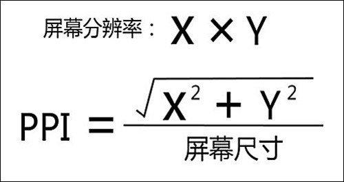
1 | function ppi(w,h,n){ |
我们以 23 英寸的显示器屏幕,1920 × 1080 的分辨率,计算下这个屏幕的 DPI(PPI):
> console.log(ppi(1920,1080,23))
< 96
所以上面常用单位中的 1 英寸是以 96px 来计算的,再计算下我当前手机的 DPI(PPI):
> ppi(1920,1080,5.5)
< 401
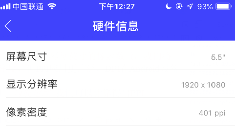
和在手机上查询到的的确相同。如果想让显示器上通过肉眼看到的元素大小和手机屏幕上看到的元素大小差不多,那么理论上就需要让手机上的元素增大 401/96 倍,但实际并没有这么简单,影响手机上显示元素的大小和电脑上显示不同的因素还有很多。
设备独立像素
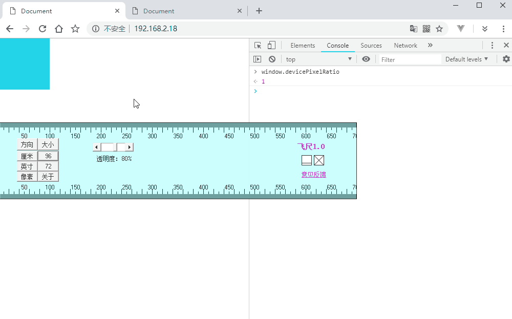
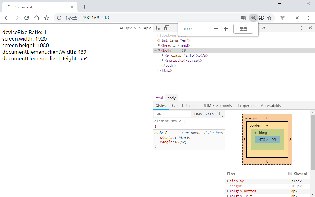
前面讲到的显示器分辨率 1920 × 1080 这个指实际的物理像素,是屏幕渲染图像的最小单位。而我们在 CSS 中编写的 px 实际上是一种逻辑上的像素。这个逻辑上的像素就是设备独立像素,可以由操作系统或浏览器来管理物理像和素设备独立像素的比例(DPR)。通过 BOM 的 devicePixelRatio 属性可以查询到物理像素和设备独立像素的实际比例:
> window.screen.width
< 1920
> window.screen.height
< 1080
> window.devicePixelRatio
< 1
默认是 1:1,所以我们在 CSS 样式中写的 100px 和实际物理像素是相同的。当我们在页面上调整缩放比例时,页面元素也跟着变化。当缩放比达到 2 倍的时候,设备独立像素是物理像素的 4 倍:(200×200)/(100×100)。
1 |
|
DPR(物理像素/设备独立像素)控制着由我们在 CSS 中编写的 px 到物理像素的映射比例:
- 当设备像素比为1:1时,使用1(1×1)个设备像素显示1个CSS像素
- 当设备像素比为2:1时,使用4(2×2)个设备像素显示1个CSS像素
- 当设备像素比为3:1时,使用9(3×3)个设备像素显示1个CSS像素
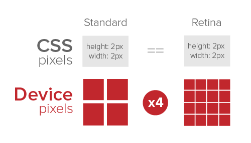
这样,在相同尺寸高清屏上和普通屏上,通过不同的 DPR 就可以让两个元素看起来大小差不多了。而设备独立像素和 DPR 就是为了解决随着技术发展,屏幕不断更新,不同 DPI(PPI)的屏幕显示图像大小差距的问题。
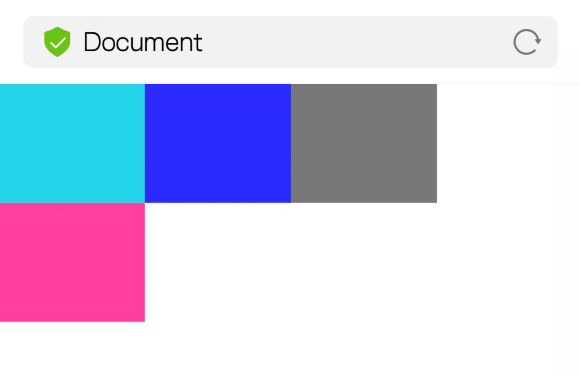
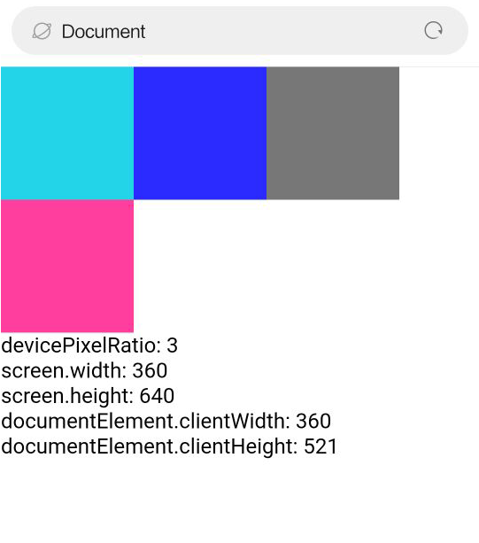
智能手机和平板设备,厂家在设备出厂时已经预设好了 DPR,同样可以通过 window.devicePixelRatio 来获取。需要注意的是,大多数的移动设备通过 window.screen.width 和 window.screen.height 无法像 PC 设备一样获取准确的屏幕物理像素!
1 |
|
Apple 6s Plus: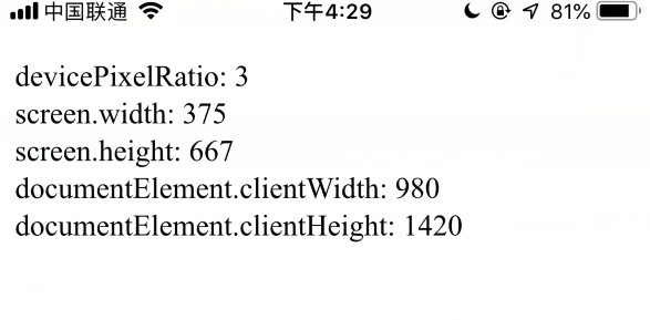
Vivo X9: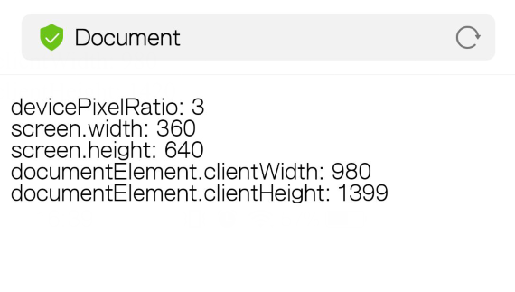
浏览器上,通过 window.screen 获取了屏幕的物理像素,通过 window.documentElement 获取了页面文档的像素尺寸。而在手机上,却获取了两对奇怪的值。安卓手机的不难发现,screen.width × devicePixelRatio 刚好等于物理像素的 1080,screen.height × devicePixelRatio 刚好等于物理像素的 1920,而苹果手机则设置的大了一些。这个就涉及到了视口的概念。
视口(viewport)
视口的概念是在移动设备才存在的。由于移动设备的屏幕一般都比较小,而且大部分网站都是为 PC 端准备的,移动设备不得不做一些处理才能让 PC 的页面正常显示在手机上。
布局视口
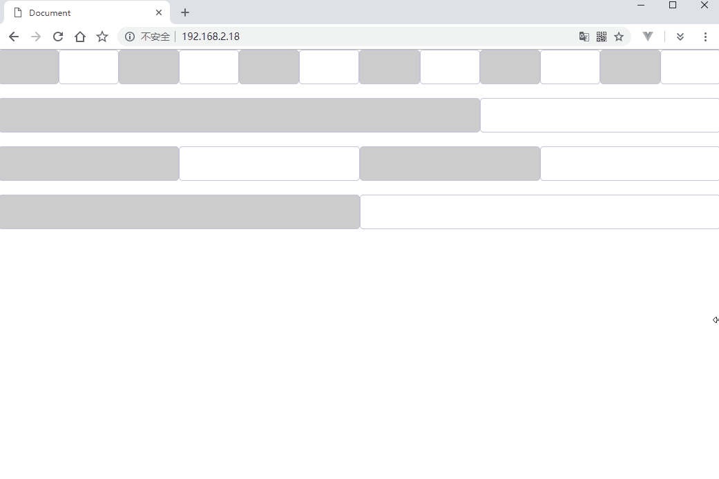
布局视口(layout viewpoer)是指我们可以进行页面布局的区域,相当于浏览器的窗口大小决定页面如何布局。移动设备的浏览器窗口是没法改变大小的,默认宽度就是屏幕的宽度。但是移动厂商并没有直接将屏幕的物理像素宽度直接给布局视口用,而是使用了一个默认值,并允许我们自行设置。这个值在大多数的设备上都是 980px 也就是我们通过 document.documentElement.clientWidth 获取的值。一般情况下我们都不关心页面的高度,因为如果高度超出会自动出现滚动条。
1 |
|
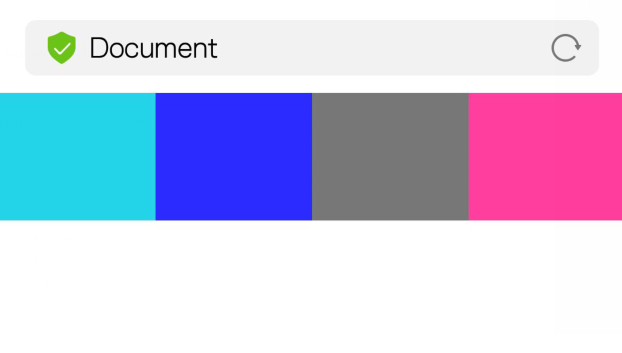
4 个宽度为 245px 的盒子刚好平铺一行,当我们把其中一个盒子的宽度增加 1 像素,立马最后一个盒子被挤下去了:
稍后再讲如何自定义这个值。
理想视口
理想视口(ideal viewport)是设备的屏幕区域,是以设备的独立像素作为单位,并由 devicePixelRatio 的值自动映射为屏幕物理像素。这个值是不可能被改变的,我们可以通过 window.screen.width 和 window.screen.height 来获取。这也刚好解释了为什么获取到的值刚好或差不多比屏幕物理像素小 devicePixelRatio 倍。
至于为什么选择 360px,375px 这样的值,大概是因为智能手机刚发展的时候屏幕物理像素大部分都是 480*320px,之后手机屏幕的技术发展,出现了 960*640px 到 1920*1080px 甚至 2K 屏的时候,为了页面尺寸兼容以前的手机,所以 devicePixelRatio 由 1 变成了 2,然后变成了 3 又变成了 4。
视口控制
我们可以在 head 标签中添加 <meta name="viewport" content=""> 来对页面进行控制。可以控制的属性如下表:
| 属性 | 可取值 | 含义 |
|---|---|---|
| width | 数值或 device-width | layout viewport 的宽度 |
| height | 数值或 device-width | layout viewport 的高度 |
| initital-scale | 数值,可以是小数 | 页面的初始缩放值 |
| maximum-scale | 数值,可以是小数 | 允许用户最大缩放值 |
| minimum-scale | 数值,可以是小数 | 允许用户最小缩放值 |
| user-scalable | no 或者 yes | 是否用户进行缩放 |
移动端浏览器上,如果页面过大,要么出现滚动条,那么缩放显得很小。理想状态下应该是既不发生缩放,也不出现横向滚动条,看看如何通过配置实现吧。
我们可以将 layout viewport 的宽度设置的和 ideal viewport 一样,这样就不会出现横向的滚动条了。设置方法是将 width 的值设置为 device-width:
1 |
|
可以看到,4 个盒子的宽度是 100px 但是页面只有 360px,所以最后一个盒子被挤到了下面,接下来将 width 的值设置为 400:
1 | <meta name="viewport" content="width=400"> |
还有一个 initital-scale 可以设置 layout viewport,它的值是页面初始的缩放比例,相当于 ideal viewport / layout viewport,所以 width=device-width 就相当于 initial-scale=1。如果值为
一般为了兼容性问题,这两个属性都要写。
maximum-scale 和 minimum-scale 是允许用户最大和最小的缩放值,超过或小于设置的值,用户就没法继续放大或缩小页面了。
还有一个比较常用的设置是 user-scalable,将它设置为 no 的时候用户就没法用双指对页面进行缩放了。添加新的设置无需创建新的 meta 标签,用逗号分隔,直接写到一起即可:
1 | <meta name="viewport" content="width=device-width,initial-scale=0.5,user-scalable=no"> |
页面布局
随着设备越来越丰富,传统 PC 页面并不能完美的展现在各种屏幕上,为不同的设备再单独开发一套页面来成本也比较大,那么如何让一套页面适应各种屏幕就非常重要了。除了传统的 PC 页面静态布局方式之外,移动互联网的发展也促进了布局方式的发展。
流式布局
流式布局(Liquid)是页面元素的宽度按照屏幕分辨率进行适配调整,但整体布局不变。代表作栅栏系统(网格系统)。网页中主要的划分区域的尺寸使用百分数(搭配 min-*、max-* 属性使用)。
栅栏系统
说到栅栏系统,就不得不说大名鼎鼎的 bootstrap。bootstrap 将整个页面或某个局部元素的行平均分成 12 等列,然后我们再分配好某个元素在不同的设备下的显示占 12 等列的具体多少列。然后通过媒体查询的方式对页面进行自适应。
看一个例子:
1 |
|
可以通过类名的方式设置页面元素在哪种屏幕下所占的比例是多少,以及在哪种屏幕下隐藏元素。没有隐藏的元素,当屏幕不够时会自动换行显示。具体的细节可以翻阅 bootstrap 中文文档
Flex布局
2009 年的时候,W3C 提出了 Flex 布局,可以非常方便快捷的实现各种页面布局,并且还是响应式的。目前PC 端,如果页面要求兼容 IE10 以下,那么 Flex 布局就不要想了,但是现在的移动端几乎全部支持 Flex。
Flex 意为弹性盒子,任何一个盒子将 display 设置为 flex 都可以指定为 Flex 布局,行内元素也可以设置为 inline-flex 来使用 Flex 布局。Flex 自成 BFC 区域,所以只会影响到当前的盒子。设为 Flex 布局后,子元素就无法使用 float,clear,vertical-align 属性了。
基本概念
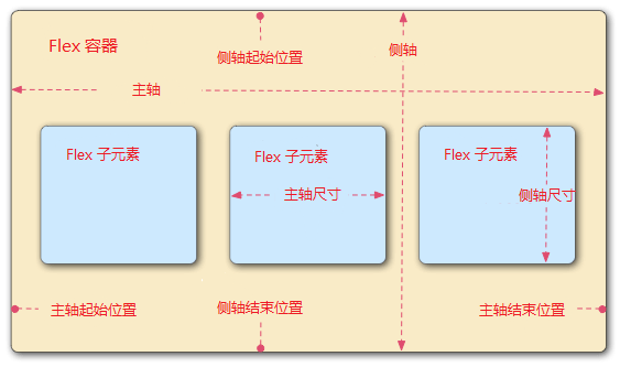
- 主轴:Flex 的子元素默认按照主轴的方向从左往右排列
- 侧轴:与主轴垂直的轴,默认从上到下。
当给父容器设置为 Flex 布局后,子元素都转为了 Flex 项目,并且在父容器内按主轴排列。每个子元素占主轴的空间叫主轴尺寸,占侧轴的空间叫侧轴尺寸。
先来体验一下 Flex 布局:
1 |
|
首先给 box1 设置了固定的宽高,那么它就会独占这么多空间,box2 通过 flex 设置它占据 Flex 容器的 2 份剩余空间,box3 占据 1 份 Flex 容器的剩余空间。之所以是剩余空间,因为 Flex 会优先给设置了固定宽高以及内容撑开的盒子分配空间,之后才会将剩余空间按照 flex 指定的份数继续分配。不过若是给 box1 也设置了 flex 属性,那么给 box1 手动设置的宽高将失效!
当对窗体进行拉伸,改变了父容器的大小时,子元素也会自动适应。这就是为什么叫弹性盒子的原因了。
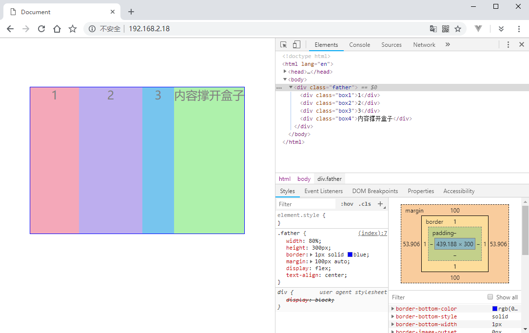
排列方向
默认 4 个盒子的排列方向是从左往右,我们也可以改成从右向左,从上到下甚至从下到上。通过 flex-direction 属性可以实现,默认属性值是 row。
从右向左排列
给父容器添加 flex-direction: row-reverse:1
2
3
4
5
6
7
8
9.father {
width: 80%;
height: 300px;
border: 1px solid blue;
margin: 100px auto;
display: flex;
text-align: center;
flex-direction: row-reverse;
}
盒子主轴起始方向变成了右边。
从上向下排列
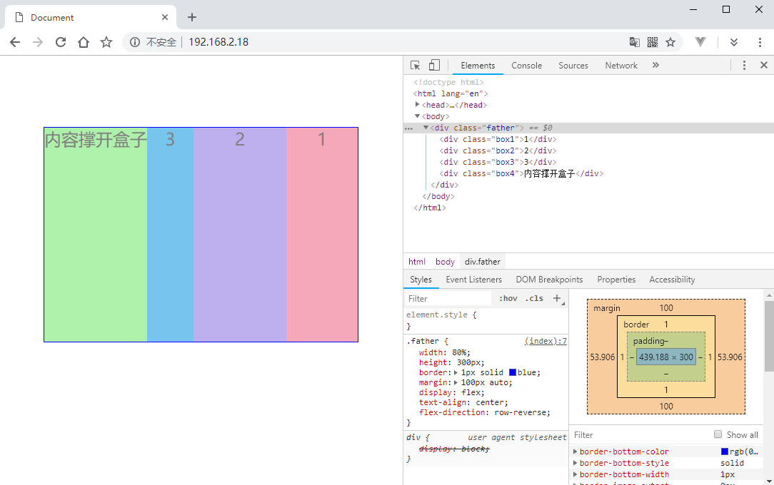
将父容器的 flex-direction 设置为 column 原来的侧轴就变成了主轴,元素将默认从上向下排列:
1 | .father { |
.box1 由于固定了宽度,因为空出一大片空白。
从下往上排列
将父容器的 flex-direction 设置为 column-reverse:
1 | .father { |
调整主轴对齐
如果子元素没有占满父元素,那么就会留下空白。这种情况我们就能调整子元素间如何对齐
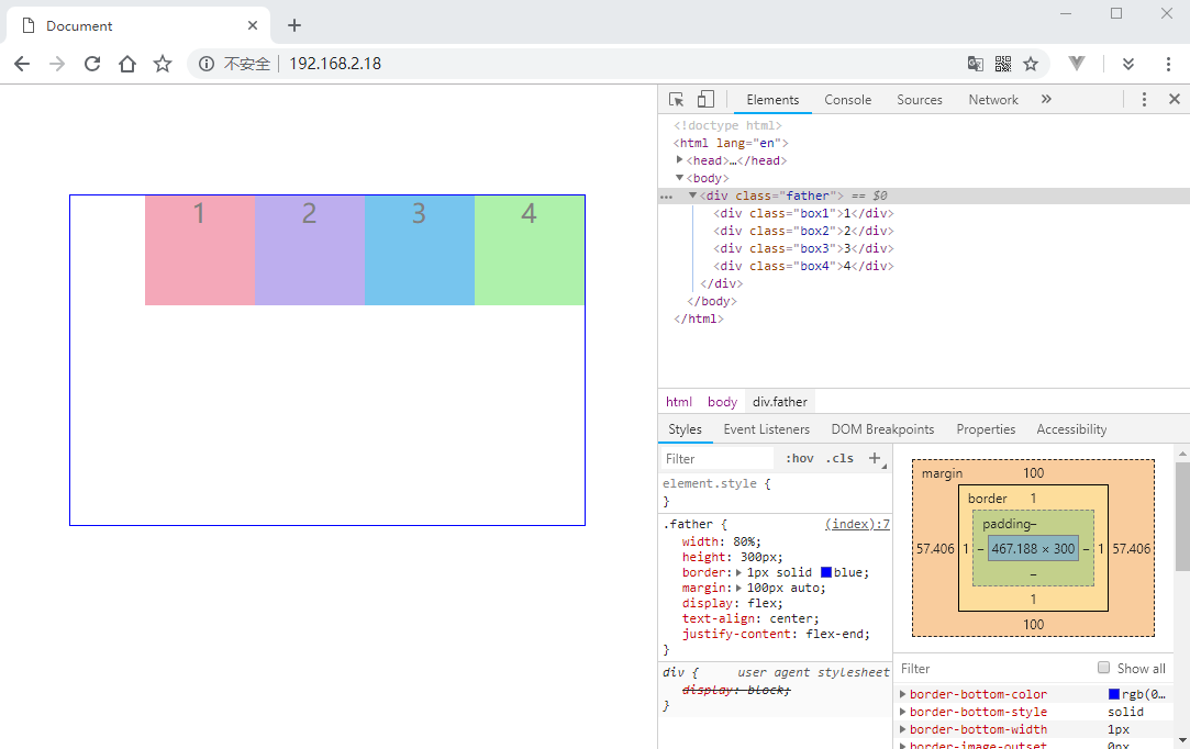
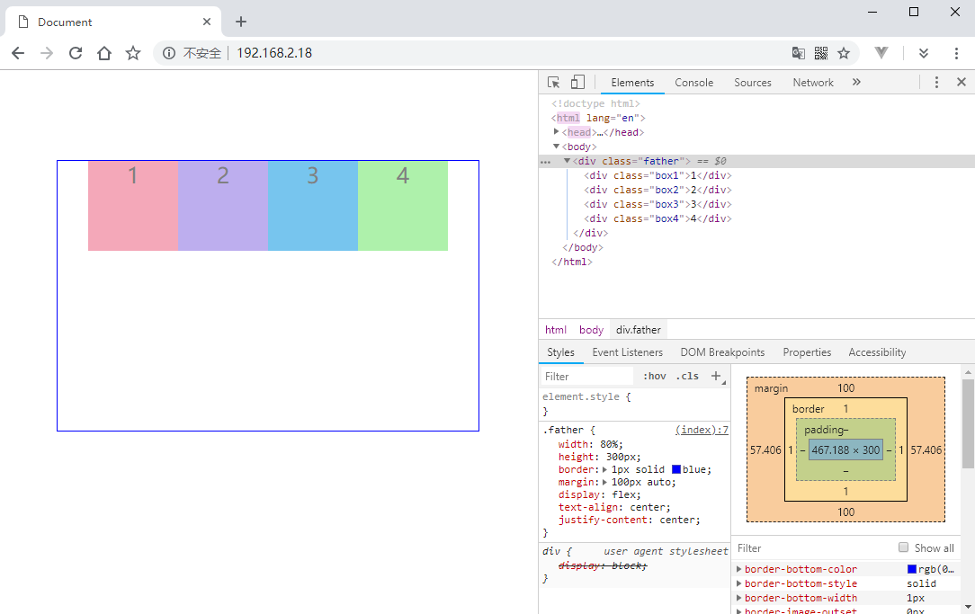
justify-content 属性用来调整子元素在主轴上的对齐方式,目前可用的值有 6 个:flex-start、flex-end、center、space-between、space-around、space-evenly。
一定要注意,调整主轴对齐会受主轴方向的影响!(flex-direction)。
主轴开始位置对齐
1 |
|
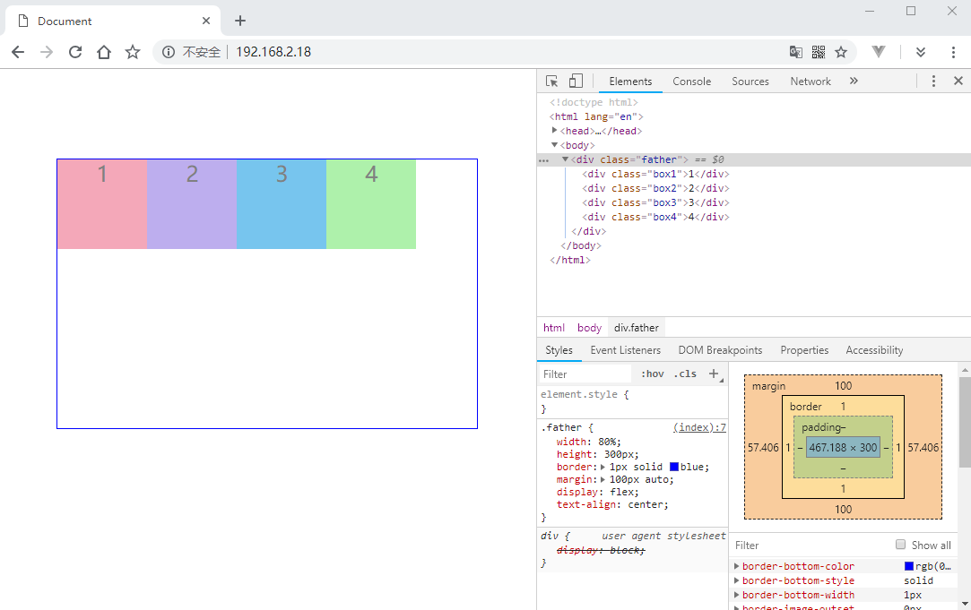
默认就是 flex-start 对齐。
主轴结束位置对齐
将父容器的 justify-content 设置为 flex-end:1
2
3
4
5
6
7
8
9.father {
width: 80%;
height: 300px;
border: 1px solid blue;
margin: 100px auto;
display: flex;
text-align: center;
justify-content: flex-end;
}
主轴中间位置对齐
将父容器的 justify-content 设置为 center:1
2
3
4
5
6
7
8
9.father {
width: 80%;
height: 300px;
border: 1px solid blue;
margin: 100px auto;
display: flex;
text-align: center;
justify-content: center;
}
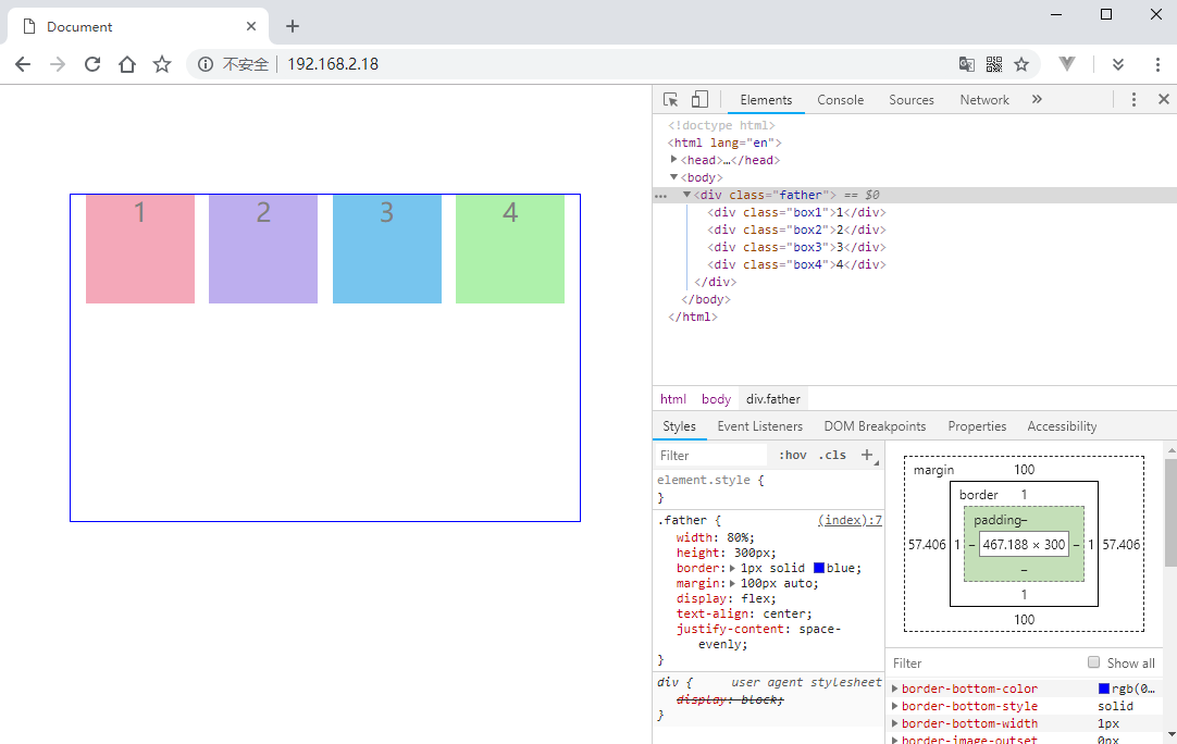
空白在子元素之间
将父容器的 justify-content 设置为 space-between:1
2
3
4
5
6
7
8
9.father {
width: 80%;
height: 300px;
border: 1px solid blue;
margin: 100px auto;
display: flex;
text-align: center;
justify-content: space-between;
}
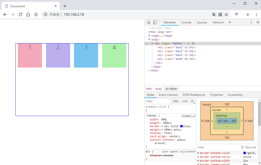
空白环绕子元素
将父容器的 justify-content 设置为 space-around:1
2
3
4
5
6
7
8
9.father {
width: 80%;
height: 300px;
border: 1px solid blue;
margin: 100px auto;
display: flex;
text-align: center;
justify-content: space-around;
}
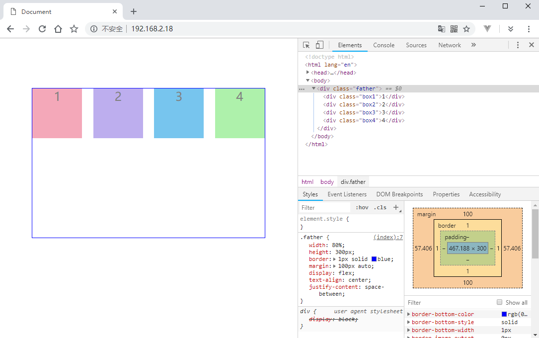
子元素平分空白区域
将父容器的 justify-content 设置为 space-evenly:1
2
3
4
5
6
7
8
9.father {
width: 80%;
height: 300px;
border: 1px solid blue;
margin: 100px auto;
display: flex;
text-align: center;
justify-content: space-evenly;
}
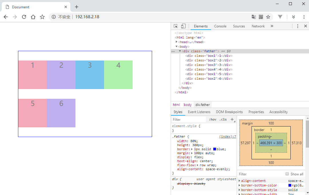
这个和 space-around 有点像,不同的是 space-around 子元素的两边空白相等,所以两个子元素中间就有两倍的空白。而 space-evenly 子元素之间和父容器之间的空白都是相等的。
调整侧轴对齐
通过调整侧轴对齐相当于调整垂直方向的对齐方式,通过 align-items 来调整。默认值是 stretch,在没有给定子元素固定高度的情况下,会让子元素自动适应父容器的高度。如果设置为其他值,则子元素的高度由子元素的内容区域撑开。
顶部对其
将父容器的 align-items 设置为 flex-start。如果没有给子元素指定高度,则默认由子元素内容区域撑开:
1 | .father { |

底部对齐
将父容器的 align-items 设置为 flex-end:1
2
3
4
5
6
7
8
9
10.father {
width: 80%;
height: 300px;
border: 1px solid blue;
margin: 100px auto;
display: flex;
text-align: center;
justify-content: space-evenly;
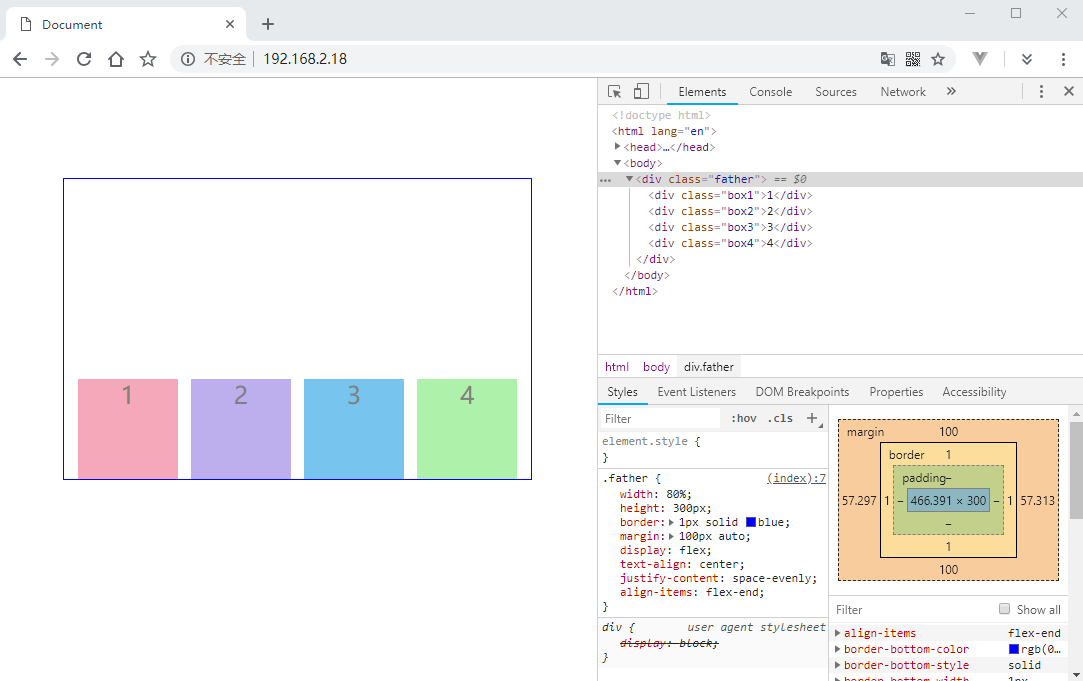
align-items: flex-end;
}
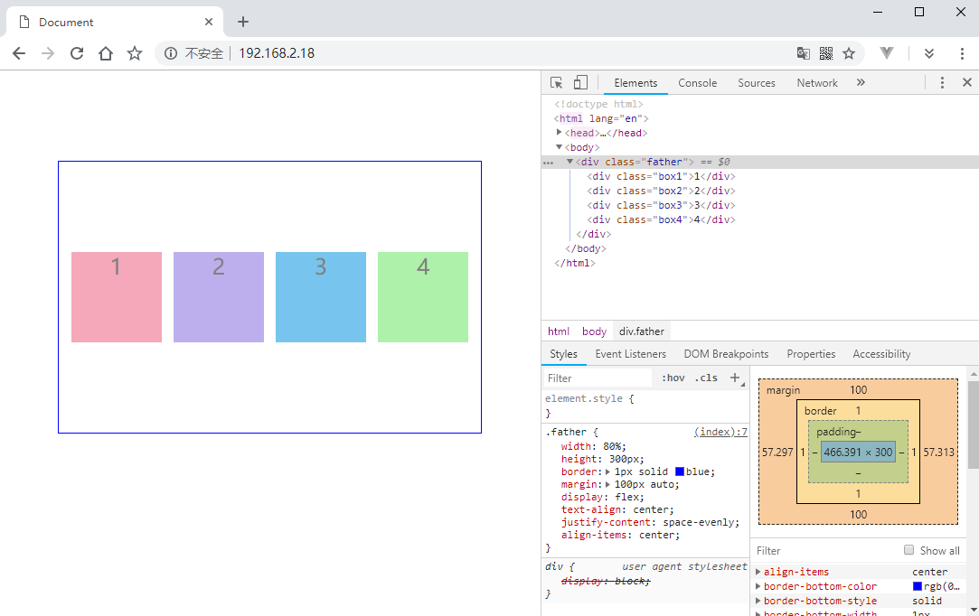
垂直居中对齐
将父容器的 align-items 设置为 center:1
2
3
4
5
6
7
8
9
10.father {
width: 80%;
height: 300px;
border: 1px solid blue;
margin: 100px auto;
display: flex;
text-align: center;
justify-content: space-evenly;
align-items: center;
}
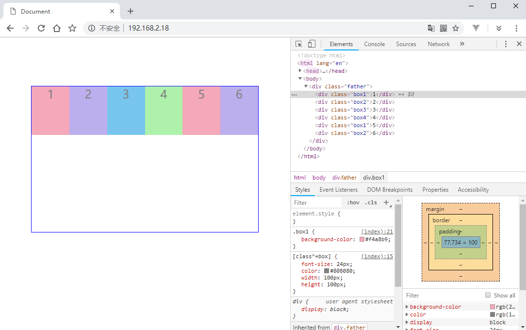
换行规则
如果子元素过多,总宽度超过父容器的宽度了,默认是不会换行的,所有的盒子会挤到一起。可以通过 flex-wrap 来改变这个规则。flex-wrap 只有三个值:nowrap,wrap,wrap-reverse。
还有一个 flex-flow 相当于 flex-direction 和 flex-wrap 的综合体,可以同时对这两个属性的值进行设置。
1 |
|
添加两个盒子,盒子的宽度被自动压缩了:
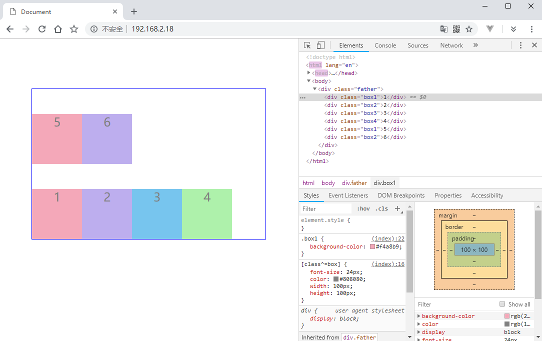
正常换行
将父容器的 flex-wrap 设置为 wrap:1
2
3
4
5
6
7
8
9.father {
width: 80%;
height: 300px;
border: 1px solid blue;
margin: 100px auto;
display: flex;
text-align: center;
flex-wrap: wrap;
}

反转换行
将父容器的 flex-wrap 设置为 wrap-reverse:1
2
3
4
5
6
7
8
9.father {
width: 80%;
height: 300px;
border: 1px solid blue;
margin: 100px auto;
display: flex;
text-align: center;
flex-wrap: wrap-reverse;
}
多行情况下的侧轴对齐
前面讲到的 align-items 是设置只有单行情况下的侧轴对齐,还有一个 align-content 用来设置多行情况下的侧轴对其。align-content 的使用必须在 flex-direction: row 和 flex-wrap: wrap 或 flex-wrap: wrap-reverse 的情况下才可以使用。
与 align-items 的性质也一样,默认 stretch,子元素没设置高度会自动拉伸。
1 | .father { |
顶部对齐
将父容器的 align-content 设置为 flex-start:1
2
3
4
5
6
7
8
9
10.father {
width: 80%;
height: 300px;
border: 1px solid blue;
margin: 100px auto;
display: flex;
text-align: center;
flex-flow: row wrap;
align-content: flex-start;
}
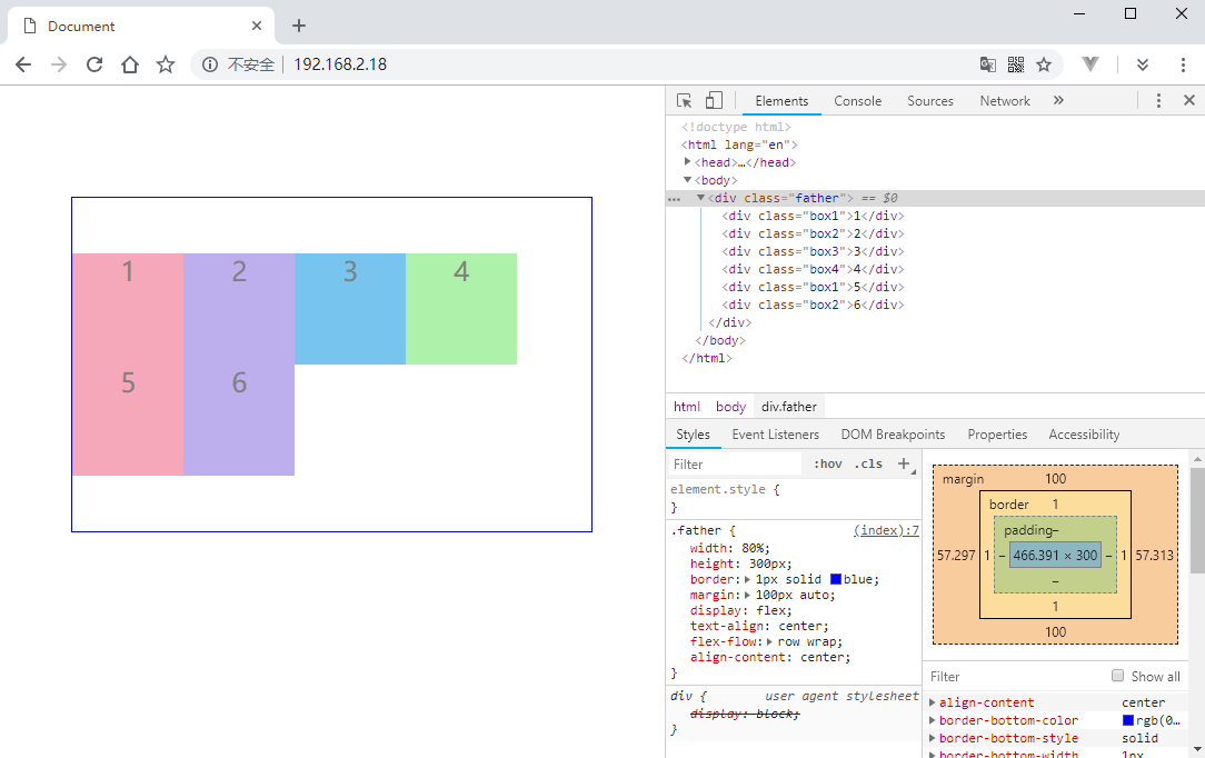
中心对齐
将父容器的 align-content 设置为 center:1
2
3
4
5
6
7
8
9
10.father {
width: 80%;
height: 300px;
border: 1px solid blue;
margin: 100px auto;
display: flex;
text-align: center;
flex-flow: row wrap;
align-content: center;
}
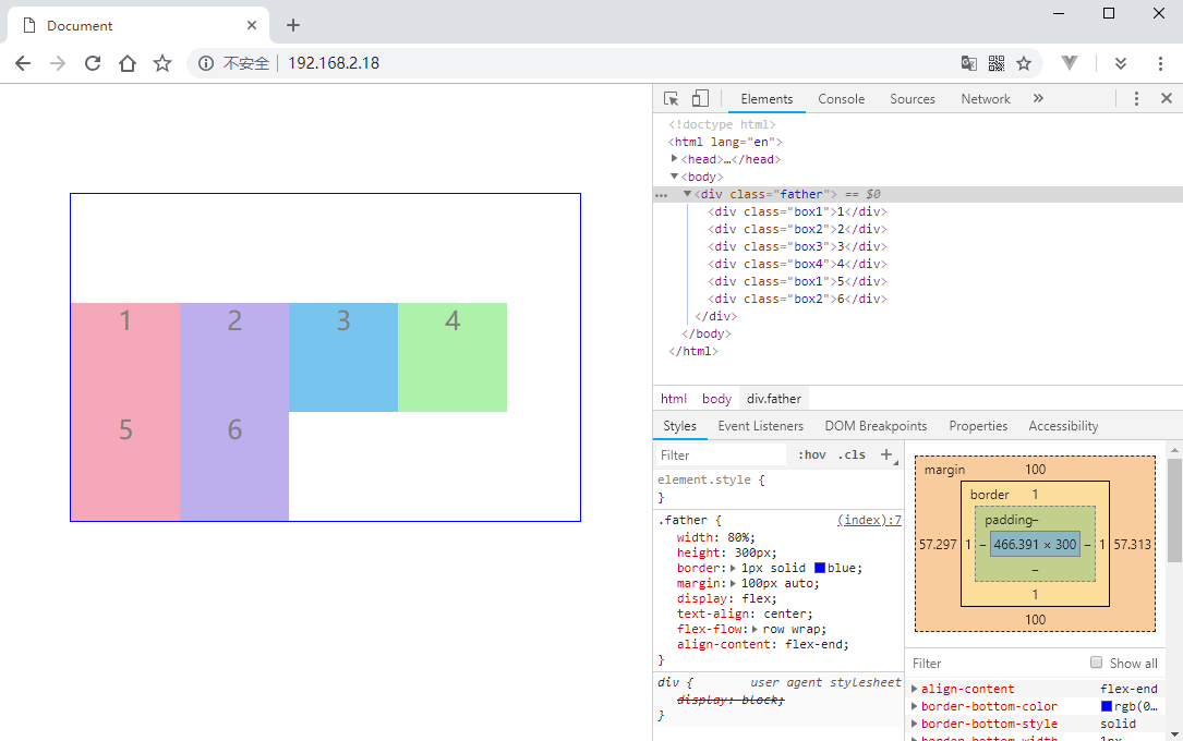
底部对齐
将父容器的 align-content 设置为 flex-end:1
2
3
4
5
6
7
8
9
10.father {
width: 80%;
height: 300px;
border: 1px solid blue;
margin: 100px auto;
display: flex;
text-align: center;
flex-flow: row wrap;
align-content: flex-end;
}
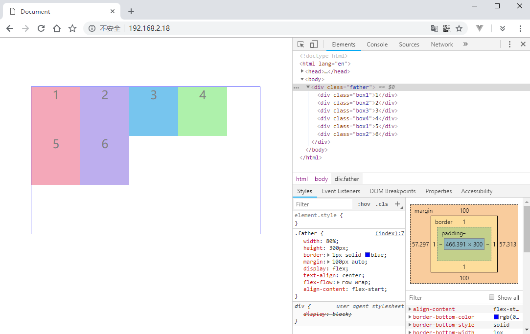
各行之间留空
将父容器的 align-content 设置为 space-between:1
2
3
4
5
6
7
8
9
10.father {
width: 80%;
height: 300px;
border: 1px solid blue;
margin: 100px auto;
display: flex;
text-align: center;
flex-flow: row wrap;
align-content: space-between;
}
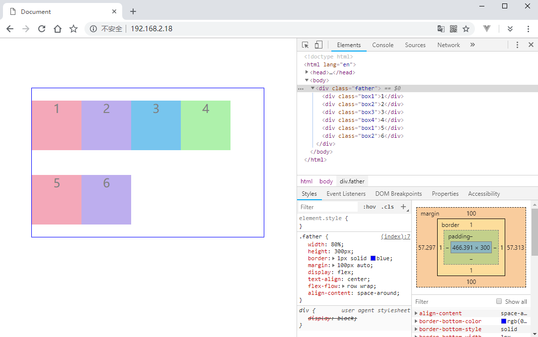
各行前后都留空
将父容器的 align-content 设置为 space-around:1
2
3
4
5
6
7
8
9
10.father {
width: 80%;
height: 300px;
border: 1px solid blue;
margin: 100px auto;
display: flex;
text-align: center;
flex-flow: row wrap;
align-content: space-around;
}
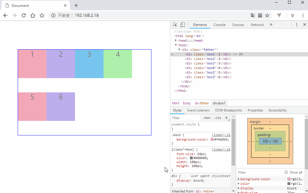
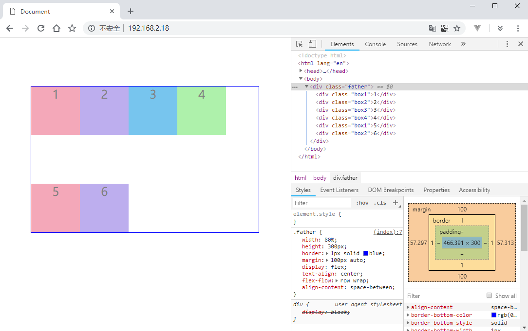
各行平分空白
将父容器的 align-content 设置为 space-evenly:1
2
3
4
5
6
7
8
9
10.father {
width: 80%;
height: 300px;
border: 1px solid blue;
margin: 100px auto;
display: flex;
text-align: center;
flex-flow: row wrap;
align-content: space-evenly;
}
子元素的一些属性
上面讲到的属性都是应用与父容器的,通过各种属性的配置已经可以实现很多复杂的布局。还有一些用于子元素的属性,可以让 Flex 布局的灵活性更高一层。
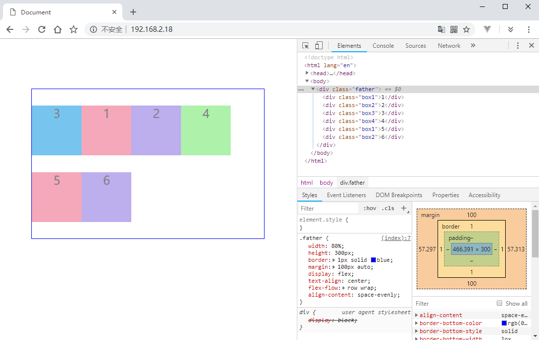
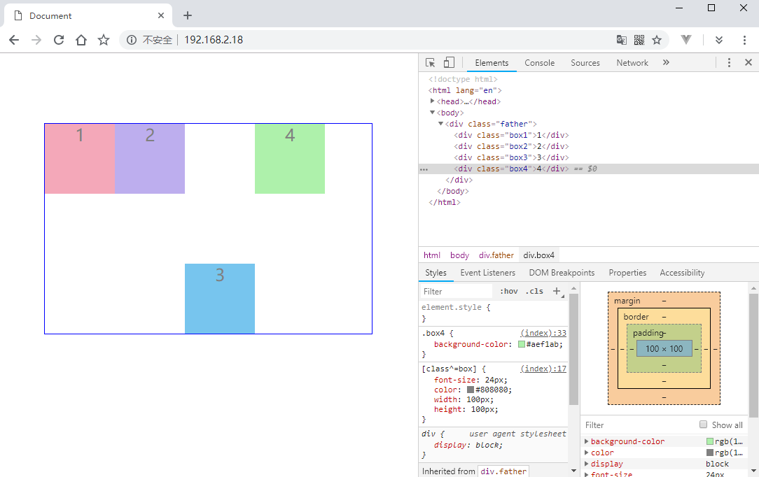
调整子元素顺序
给子元素的 order 属性设置不同的值,值越大的越靠后,默认是 0 。
1 | .box3 { |
只给 .box3 应用了 order 属性,-1 比其他子元素的 order 都小,所以会排在第一个:
子元素放大比例
使用 flex-grow 可以配置当某一行拥有剩余空间的话,将某个元素放大到剩余空间的倍数。值默认是 0 ,不进行放大。
1 | .box4 { |
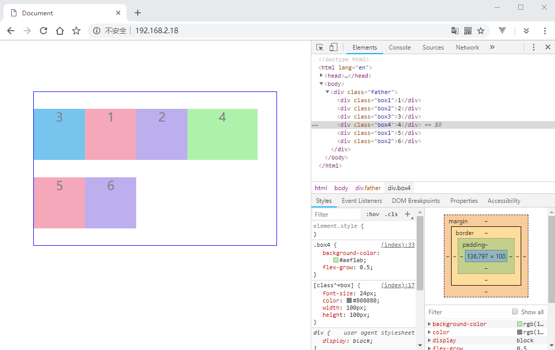
0.5 倍表示如果一行的剩余空间为 80px 那么 .box4 最多会被放大到 140px,因为剩余空间的 0.5 倍是 40px。
子元素缩小比例
使用 flex-shrink 设置一行空间不足时,子元素自动缩小的比例。默认是 1。
1 |
|
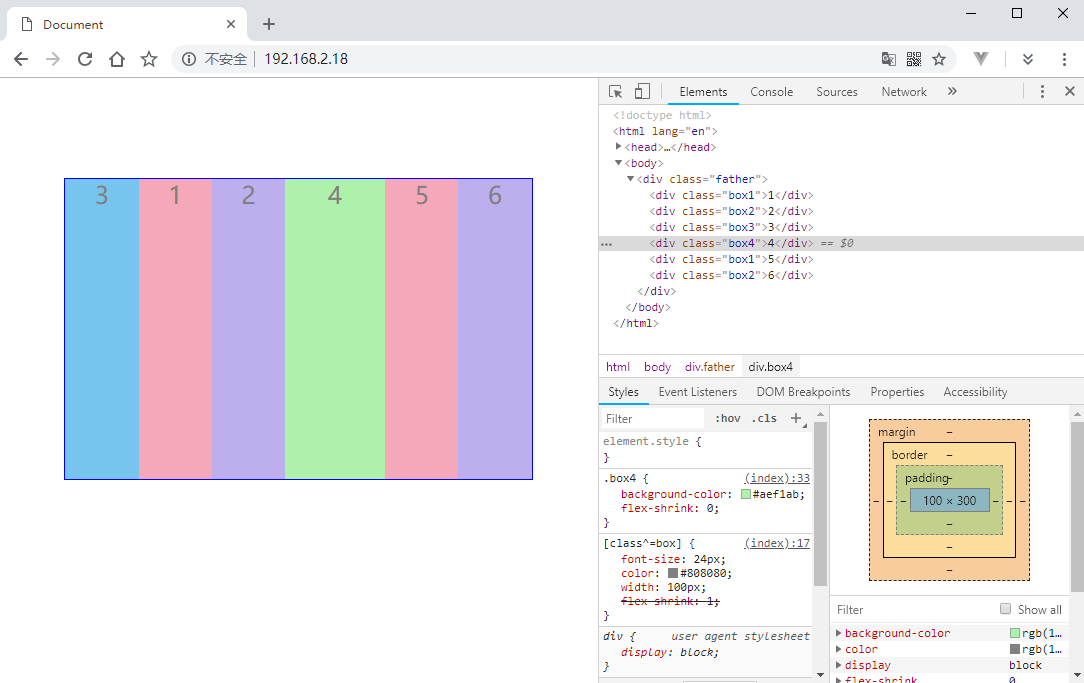
当其他元素的 flex-shrink 为 1,.box4 为 0 的时候,如果没有剩余空间,那么其他元素都会缩小,而 .box4 不会。
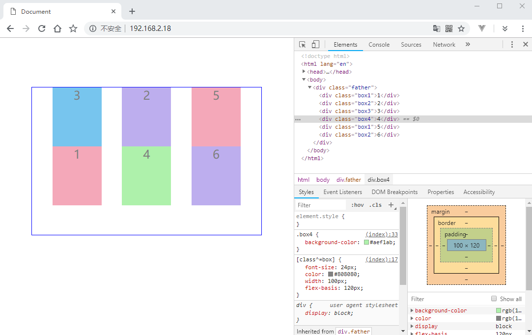
子元素占据固定空间
flex-basis 属性定义了分配多余空间之前,项目占据的主轴空间尺寸。如果 flex-direction 是 row,那么 flex-basic就相当于 width,如果 flex-direction 是 column,它就相当于 height。
1 |
|
子元素所占空余空间份数
flex 属性设置子元素占据空余空间的份数,这个在 Flex 布局的刚开始就演示了,这里就不再多说。
子元素设置特有的对齐方式
默认子元素的对齐方式是从父容器的 align-items 继承来的,通过 align-self 属性来进行设置,值是 auto。
1 |
|
媒体查询
基本概念
媒体查询是响应式开发中重要的知识点,比如 bootstrap 的响应式布局本质上就是借助媒体查询实现的,那么到底什么是媒体查询呢?其实就是查询屏幕的宽度,然后针对不同的屏幕宽度设置不同的样式来适应不同的屏幕。简单来说,就是给不同屏幕尺寸编写不同的样式,然后 CSS 会自动根据实际的屏幕来应用我们预先编写好的样式。
bootstrap 中给不同的设备预定义了一些尺寸,这些只是作为建议:
| 设备 | 尺寸 |
|---|---|
| 超小屏幕,手机等设备 | w < 768px |
| 小屏设备,平板等设备 | 768 <= w < 992 |
| 中等屏幕,桌面显示器等设备 | 992 <= w < 1200 |
| 超大屏幕,大型的显示器 | w >= 1200 |
语法规则
1 | @media mediatype and|not|only (media feature) { |
或者针对不同的媒体使用不同的外部样式表:
1 | <link rel="stylesheet" |
mediatype 的可选值除了已经废弃的有如下几种:
| 值 | 说明 |
|---|---|
| all | 用于所有设备 |
| 用于打印机 | |
| screen | 用于电脑屏幕、平板电脑、手机等 |
| speech | 应用于屏幕阅读器等发声设备 |
and|not|only 实现简单的逻辑,媒体功能(media feature)最常用的就是 min-width 和 max-width 了。
接下来看看具体如何编写媒体查询吧。
自适应实现
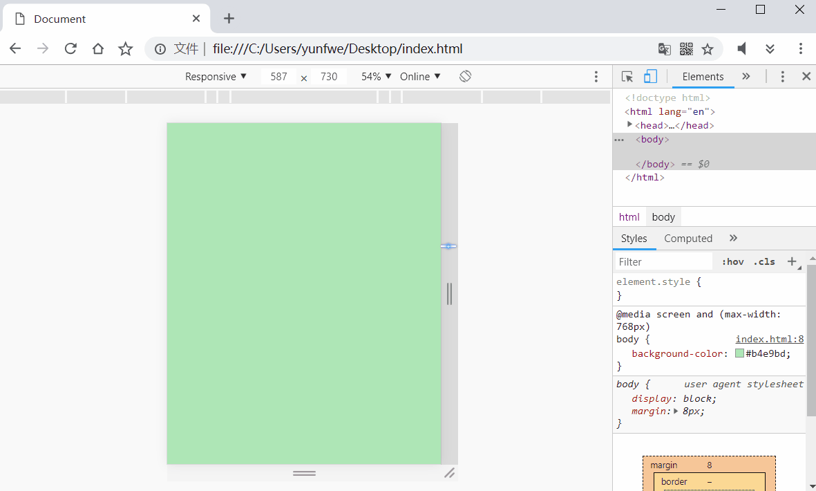
我们现在要编写一套和 bootstrap 一样的媒体查询功能,首先编写屏幕像素小于 768px 的媒体查询:
1 |
|
这条规则白话文来说就是:如果我们在使用电脑或手机屏幕,并且屏幕的尺寸最大 768px,那么就将页面的背景变成淡绿色。接下来添加大于 768px 小于 992px 的规则:
1 | <style> |
这条规则意思是:当屏幕尺寸最小 768px 并且最大 992px 的时候,将页面背景变成淡红色。接下来添加大于 992px 小于 1200px 的规则:
1 | <style> |
当屏幕尺寸最小 992px 并且最大 1200px 的时候,将页面背景变成淡紫色。屏幕尺寸大于 1200px 的规则:
1 | <style> |
屏幕大于 1200px 时,页面背景变成淡蓝色,接下来看看实际表现如何:
代码优化
上面的代码虽然已经实现了我们希望的功能,但是一般并不会这么啰嗦的写。我们可以借助设置默认样式和 CSS 的样式覆盖特性来简化代码:
1 | <style> |
我们先设置个默认的背景色,然后随着屏幕尺寸变大,当满足大于 768px 的时候,就自动应用了相应的样式并覆盖掉默认的样式。接着屏幕继续变大,当满足大于 992px 的时候,又将大于 768px 的样式覆盖掉。以此类推,当屏幕大于 1200px 的时候就没有可以覆盖掉它的媒体查询了。
媒体查询有好处也有坏处,坏处就是移动端和桌面端所需要的样式是并不相同的,甚至移动端有一些页面元素也不需要显示,但是依然会将所有的代码都下载下来,甚至不需要显示的一些图片等资源也会被下载下来。
rem布局
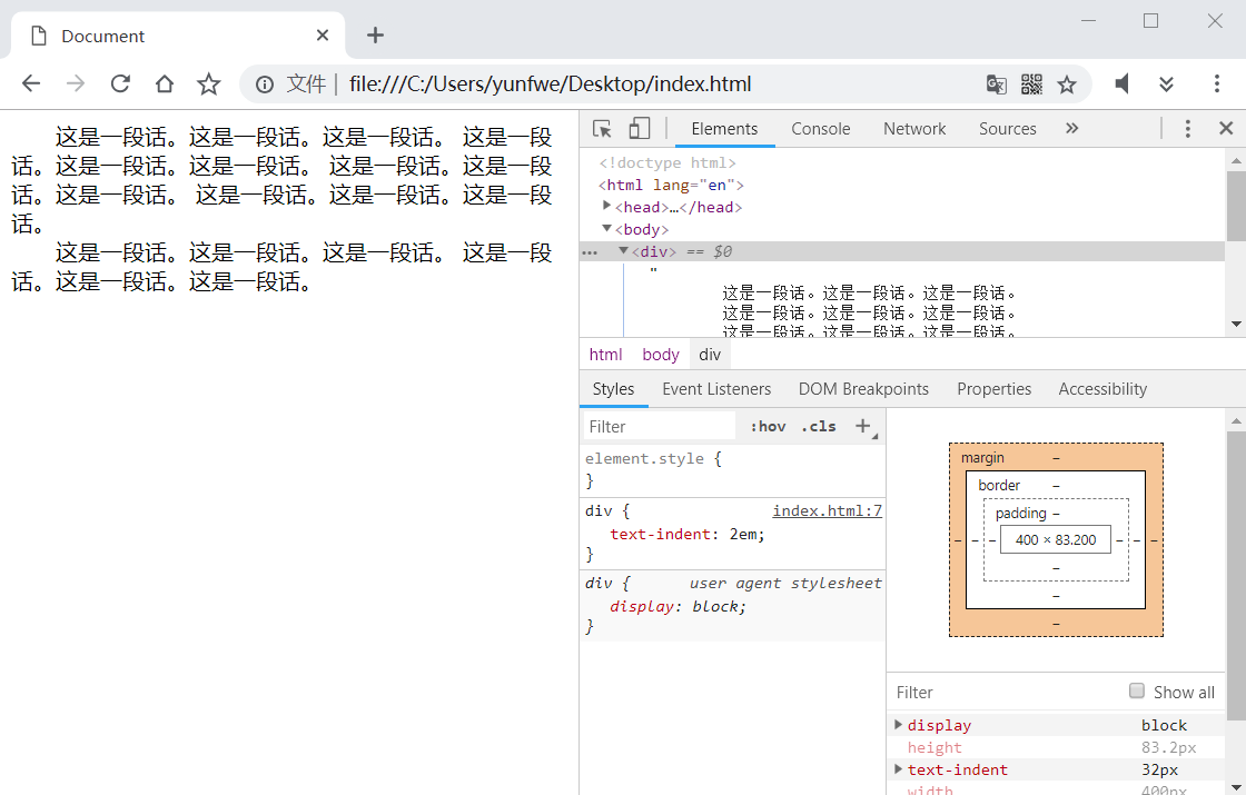
rem 屏幕与像素的一章中有讲到,是一个尺寸单位。有一个与它类似的单位是 em,这个单位与 px 的换算基于当前容器的字号,则字号所以经常被用在段落首行缩进上:
1 |
|
但是 em 并不适合布局,浏览器默认字号是 16px,但是每一个页面元素的字号并不全部相同,那么 1em 在不同的元素中可能都不相同,会给我们带来换算上的麻烦。而 rem 基于根标签(html)的字号,这样整个页面中 1rem 的值每个元素中都是相同的。
1 |
|
将 html 的字号改为 20px,10rem 的确相当于 200px。这样的好处是什么呢,那就是我们可以只更改根元素的字号,就可以让页面其他使用 rem 的元素都进行改变而不用改它们的样式。最简单的方法就是配合媒体查询,不同的屏幕像素,然后给根元素一个不同的字号。
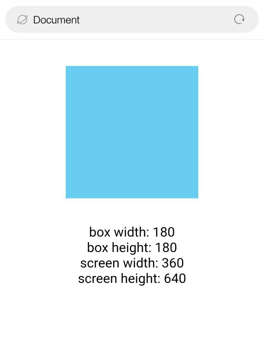
这个字号该如何计算呢?这个并没有一个标准,我们可以将屏幕分成 20 份,然后将每一份的值做为字号。比如移动端如果 viewport 的 device-width 为 360 像素,我们就可以将字号设置为 360 / 20 = 18px。下面看代码实现:
1 |
|
安卓端显示:
苹果手机显示:
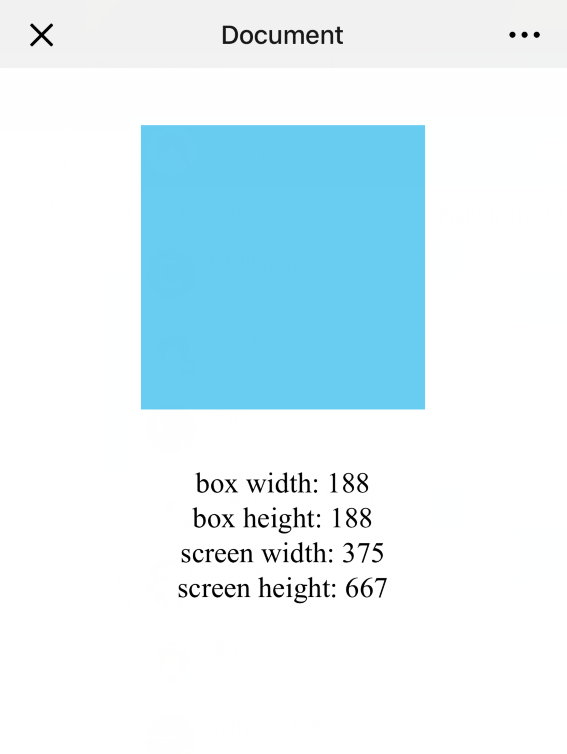
iPad显示:
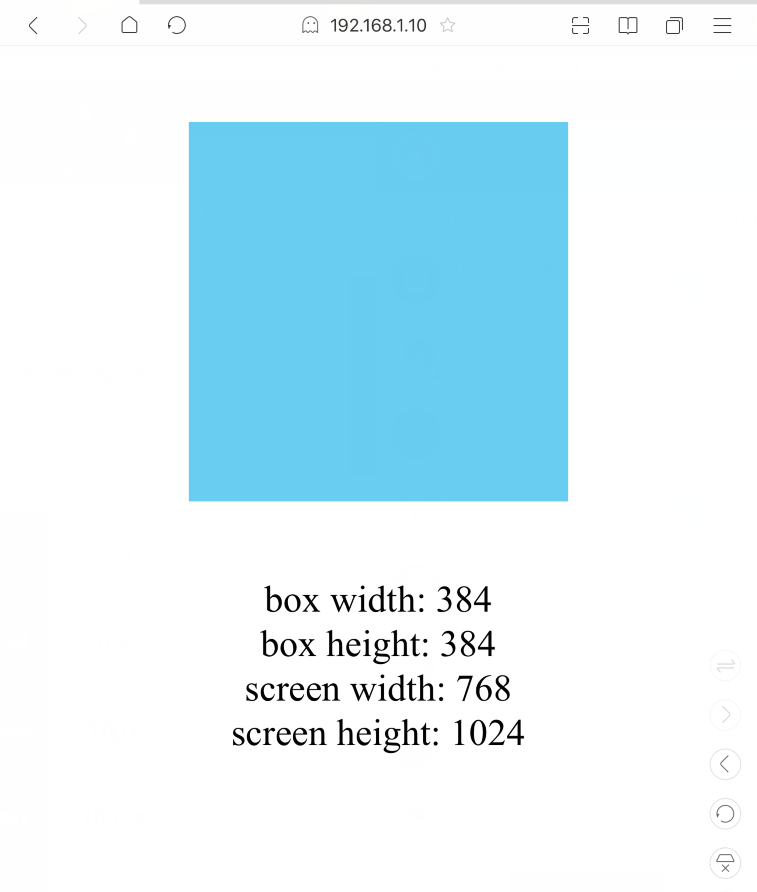
PC端显示:
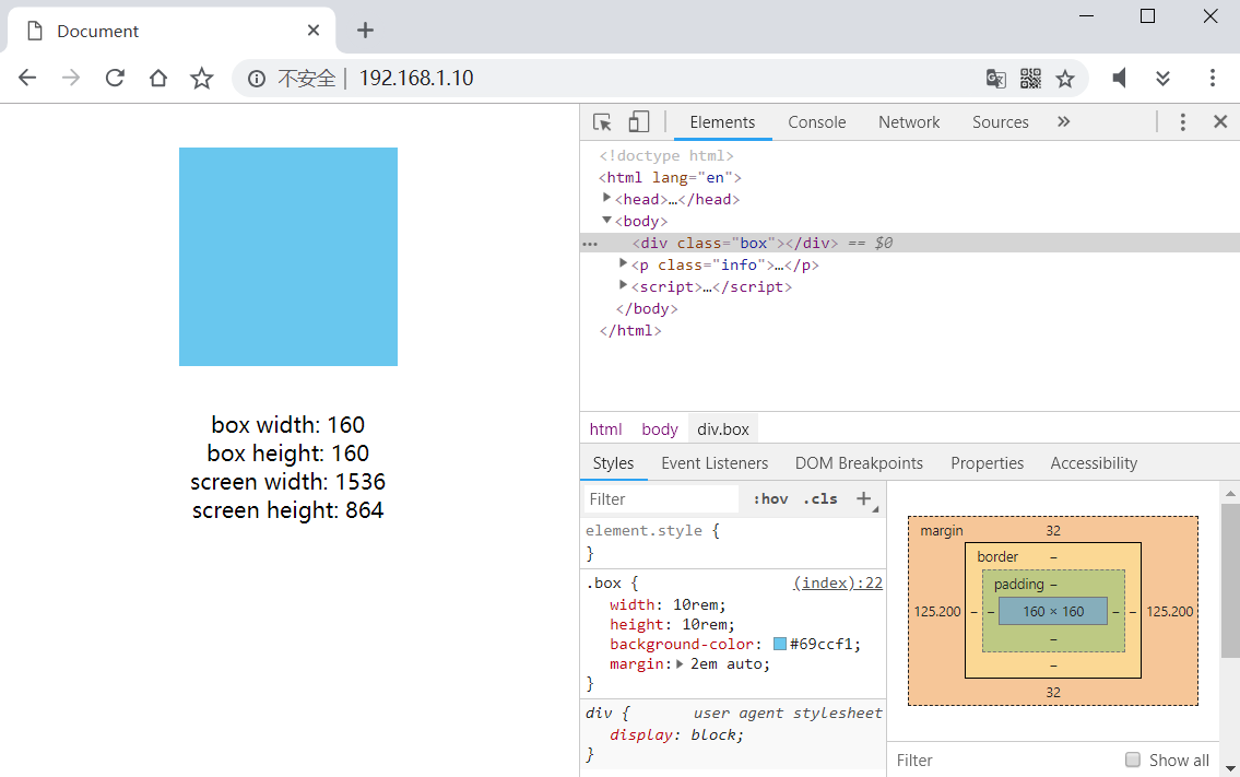
由于 PC 端 Win10 的原因,对显示器进行了 1.25 的缩放,所以 1536 × 1.25 = 1920 才是实际的分辨率。